How To Design a Website In 8 Simple Steps
Our independent research projects and impartial reviews are funded in part by affiliate commissions, at no extra cost to our readers. Learn more
While you shouldn’t be scared of designing websites, you shouldn’t underestimate its importance either. In fact, having a well-designed website is critical – if there’s one part of your site’s UX that’s awkward or difficult, that could be a sale or a repeat visitor potentially lost.
Additionally, Google prioritizes great user experience, meaning bad design could cause your site to rank poorly in search results. If you’re building your own site, we recommend Wix as our top choice. It’s easy to use and is the most trusted by us and our users in our research.
With that out of the way, let’s get those creative juices flowing!
1. Define Your Site
It sounds like such a simple point to make, but before you jump head-first into designing your website, you first need to be clear on its purpose.
Beyond simply knowing your industry and defining a content strategy, you need to think about what your USP (unique selling point) is, and how you want to come across.
If you put yourself out there just to make a profit or raise your own profile, people will see through it. Your website’s design is directly linked to your brand, and it needs to come across as authentic and engaging.
“An organization’s ‘culture of purpose’ answers the critical questions of who it is and why it exists. They have a culture of purpose beyond making a profit.”
– Punit Renjen, Deloitte
Further Information
- How to Build a Website – This guide focuses on how to design a website. If you want to know, head over to our step-by-step manual.
What are you trying to achieve?
Once your purpose is clear, the focus shifts towards what action you want visitors to take when they land on your website. Is your site there just to display information? To sell products? To get sign-ups? Are you selling a service?
The answer to this will ultimately dictate how your website looks and feels. Using ecommerce as an example, one crucial element of your design is your landing page. In a recent report we put together on landing page statistics, we found that landing pages have a 160% higher conversion rate than other signup forms!
According to Crowdspring – a top digital branding company – your landing page should be laser-focused around one product or deal, with a clear CTA (call to action) accompanying it.
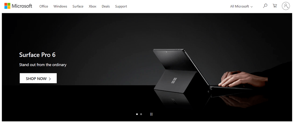
Taking this one step further, we caught up with Wolfgang Bruns, a conversion rate expert at a global tech company. We asked him about the importance of having separate landing pages for different visitors, in order to individually tailor offers and products – a process known as customer segmentation. Here’s what he had to say:
Advice from Experts
Understanding your users is essential to the success of any business. It means you can customize and improve the experience you deliver and better serve their needs. Doing that has a direct impact on the bottom line. Segmenting your traffic to provide a more relevant experience is your first step on the journey to a personalized user experience, and the business success that comes with it.

Further Information
- 5 Awesome Homepage Layout Designs – Draw inspiration and gain insight from our top tips!
- Hibu Review – Discover if Hibu’s web design service could help you. We went undercover to test it, and here’s what we found…
- Webflow Review – See our review of the web designer’s platform, Webflow. Get the creative options only used by the pros…
2. Web Design Research
Web design evolves quickly, but there are some more prevalent trends you can learn from. At this point, it’s important to note that just because a web trend is current, it doesn’t mean it’s necessarily right for you.
75% of people said that a website’s credibility comes from its design, so it’s important to take your time and look at what competitors are doing. Each sector will have different styles, so it’s vital you know whether you want to fit into your industry, or disrupt it.
Alex Vasili – a leading brand expert – believes you should always research by industry, rather than age or gender. When speaking to us about web design, he said:
Advice from Experts
There’s a whole load of stuff in terms of color theory – which colors suggest certain emotions, and how they place you in a sort of feeling. I think it depends on whether you’re trying to disrupt or trying to fit in. If you’re trying to disrupt, then you want something completely different to what the sector is offering. But if you’re trying to fit in, there are clear patterns. If you’re a tech company, you’ll probably have some blue in there, whereas if you’re a start-up, you might have a really vibrant, hot color in there. The same goes for your font. You’ll want a really clean, simple design, and a lot of whitespace.
Not sure what color theory is? Learn more about Website Color Theory and how to apply it on your own website in our full guide next!
Stay ahead of the trends with a web designer
If you have the budget for a web designer, they can help build a site that’s ahead of the game when it comes to design trends.We’d recommend using the web design comparison tool powered by Expert Market for web design quotes tailored to what you need — it only takes one minute and it’s totally free to use! takes
This goes to show the importance of knowing what you want before diving into the physical design itself. We’ll come back to color in the ‘Branding’ section, but to help you out, here are some current trends that are taking the internet by storm.
Micro-interactions
Micro-interactions are small animations which takes place when a user engages with a website. For example, if you ‘react’ to a post on Facebook, it will pop up with the relevant, animated emoji.
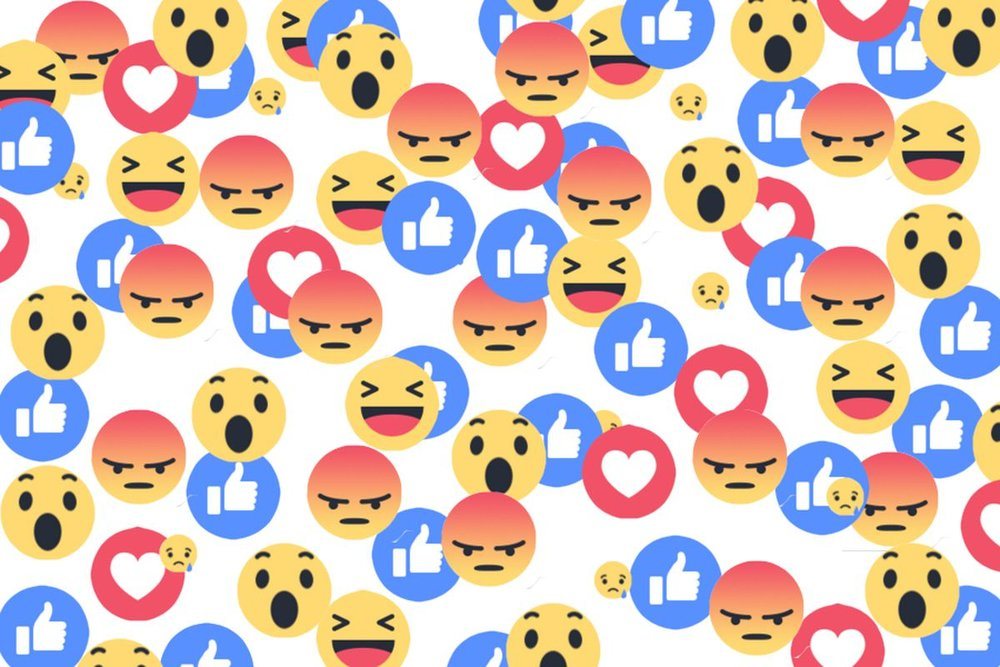
Micro-interactions are there to inject a website with some personality. Micro-interactions create a human touch point that actively makes your visitors feel like they are communicating with your website.
Micro-interactions can take many forms – clicking, hovering, scrolling etc. – and are important in building a relationship with users. They might not suit serious white-collar businesses, but most sites could benefit from a little interaction.
Brutalism
If you thought you wouldn’t be learning about architecture in this guide, we’re afraid you’re sadly mistaken. Brutalist web design takes its inspiration from mid-twentieth century building construction, and although many people see it as ugly, it just works.
Spanish fashion house Balenciaga was one of the first major companies to adopt a brutalist website back in 2016. And much like its seasonal trends, brutalism has quickly caught on.
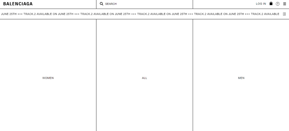
Brutalism derives from the French word ‘brut’, meaning ‘raw’, and offers a basic, bold and striking approach to web design. It’s not for everyone, but those looking to disrupt their industry will certainly want to take note.
Chatbot Support
Here’s a stat for you: businesses spend nearly $1.3 trillion every year on customer service requests. It’s estimated that chatbots could reduce this by 30%.
Gone are the days when chatbots were mere gimmicks – now, they’re becoming ever more essential to customer-facing services.
The major draws of chatbots are time-efficiency and cost-effectiveness. They work 24/7, which frees up your time to get on with other matters. They also save you the expense of employing staff to work as customer service representatives.
Sure, chatbots aren’t perfect, but their emotional intelligence and ability to provide tailored support is improving by the day. There’s never been a better time to install one, and there are plenty of chatbot services to choose from.
More Information
- Parallax Website Examples: Consider parallax scrolling for your website
3. Choose Your Platform
The first thing that springs to mind when you think of quality web design is a professional agency, right? And while top companies largely do a great job, they can be eye-wateringly expensive.
Luckily, there is another way: website builders and ecommerce platforms. These are DIY online tools that allow you to create and design your own website – without needing to know a single line of code!
Naturally, there are tons of options out there – of varying quality – but we’ve put in the legwork and researched the best on the market. Through a combination of expert research and thorough testing, we can now reveal the best options for designing your very own site.
Further Information
- 10 Best Website Builders – Explore the very best on the market.
- 7 Best Ecommerce Platforms – Check out our mini reviews of each.
- Ecommerce Platforms Comparison Chart – Easily identify which platform works for you.
What about WordPress?
WordPress.org is a self-hosted, open-source CMS (content management system) – but all you really need to know is that it’s the most popular platform for designing a website.
WordPress gives you total control over the look and feel of your website, and is technically free to use. We say this because, in order to get your website live, you’ll actually need to pay for web hosting, security, a domain name, and any additional plugins or themes you need.
The biggest issue with WordPress, though, is that it’s not really suitable for the average Joe. Unless you’re comfortable with code – or have the budget to hire a professional developer – WordPress will prove near-impossible to use.
For this reason, we’d recommend that people who are building their own site stick to website builders and ecommerce platforms.
Further Information
- WordPress.org Review – Learn more about the world’s most popular platform.
- WordPress.com vs WordPress.org – Find out the difference between the two.
Designing Websites: Website Builders
Unless you’re looking to sell online, website builders are the most effective way for non-tech whizzes to create their own website. If an online store is what you’re after, skip to our ecommerce platforms section.
From our expert research, we’ve been able to establish the best website builders available to you today. All cater to different needs, but here are our top three recommendations:
Wix
| Wix Pros | Wix Cons |
|---|---|
| Highly intuitive and easy-to-use editor | Can’t switch templates after your website goes live |
| Great improvements to SEO | May have to spend more on third party apps to scale your website |
| Strong help and support features | The sheer choice and amount of customizable options can be overwhelming |
| The builder our users were most likely to recommend |
Wix is generally regarded as the best website builder on the market. Its easy to use drag-and-drop editor gives you total creative control, allowing you to add in all your content and position it wherever you see fit.
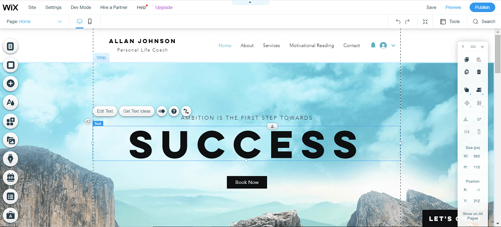
There’s also a choice of over 800 professionally designed templates, a bunch of amazing features which come built-in, and a huge app store where you can install any extras you may need.
Additionally, Wix has made great strides in its online marketing capabilities, meaning you can get more people to visit your site. Recently, Wix announced integration with Semrush, one of the biggest keyword data tools around. With this new tool, you can see exactly what your visitors or other people are searching for, giving you a major leg-up on the competition. Neat!
From thoroughly testing the platform ourselves, we can confirm Wix lives up to the hype. Have a look at our final research scores and see for yourself:
We also arranged for regular people, just like you, to sit down with Wix and attempt to design their own website. These volunteers were blown away by just how quick and easy Wix was to use, as well as the sheer choice of features on display. Here’s what they had to say:
“I was genuinely surprised that it was that quick [to design a website]. I didn’t think that it would all get done in an hour.”
“I like the side menu where you can add images and apps etc. because it was simple and easy to navigate.”

Further Information
- Wix Review – Read more about Wix in our in-depth review.
- How to use Wix – A step-by-step guide for beginners.
- Wix Editor vs Wix ADI – Learn about the different ways you can create a Wix website.
Squarespace
| Squarespace Pros | Squarespace Cons |
|---|---|
| Best quality templates in terms of design and flexibility | Limited number of price plans |
| Really beginner friendly | Sitespeed could use some improvement |
| Great online marketing capabilities |
Squarespace is a website builder that oozes class, and comes with a glossy, premium feel.
Squarespace prides itself on its templates. Their cutting-edge designs make them perfect for anyone in a creative field, such as photographers, artists, or graphic designers.
Squarespace is also super easy to use and great for beginners. In fact, Squarespace recently made its editor even easier to use with the new drag-and-drop Fluid Engine, which allows for even better customization of Squarespaces’s top tier templates.
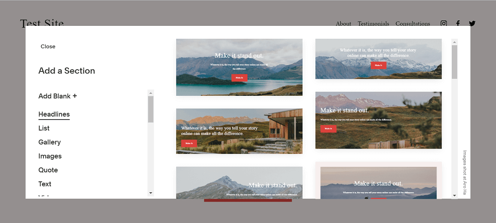
Squarespace also comes with an array of quality features. Here you can see how it scored in our research for all the major categories:
Squarespace proved a real hit with our users, too. Here’s just a couple of their thoughts:
“My website looks really clean and fresh. I think a lot of that is down to how well the template I chose is designed.”
“It’s a huge challenge to create a site by yourself unless you’re a designer, so the fact that the templates have industry-specific features is a huge benefit. I’d say that’s one of the most important factors [when designing a website].”

Further Information
- Squarespace Review – Discover why Squarespace is a dream for creatives.
- How to use Squarespace – Our simple handbook for using Squarespace.
- Squarespace Pricing Review – Which plans offer real value for money?
Designing Websites: Ecommerce Platforms
Ecommerce platforms work in a very similar way to website builders, but they’re specifically designed to help you set up an online store. Some are purpose-built just for ecommerce, while others (like Wix) are website builders that have ecommerce functionalities.
Wix eCommerce
| Wix eCommerce Pros | Wix eCommerce Cons |
|---|---|
| Eye-catching designs – add product videos to give customers a better shopping experience | No social media integration – doesn’t let you sell across multiple channels, such as Facebook, Instagram, and Pinterest |
| Advanced ecommerce tools, including abandoned cart recovery to catch customers who have left items at the checkout | Too much creative freedom, which can get in the way of ecommerce design best practices |
| Multilingual sites – grow your business globally by creating multiple sites for different countries |
“But haven’t you already covered Wix?” Well, yes – but building an online store with Wix is a whole other ball game!
Wix is the best ecommerce website builder we’ve tested, scoring an impressive 4.7 out of 5 overall. It’s perfect for people who want to run a small store, selling less than 10 products, or want to add a store section to their existing website.
Anyone who sells products on the side could benefit from Wix. If you’re in a band, for example, the main purpose of your site will probably be to provide fans with tour information and take bookings for gigs.
However, you may also want to sell merchandise, such as tour tops, albums, and branded instruments. Wix makes it easy to either build an online store from the off, or add in a store section further down the line.
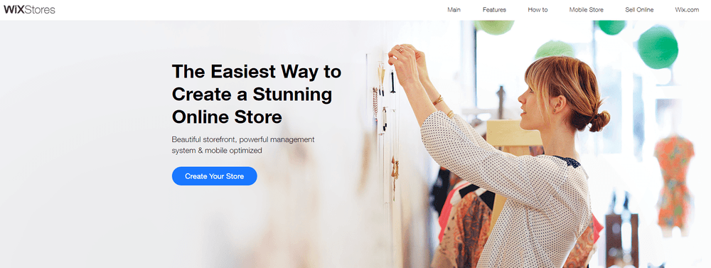
Here are Wix’s ecommerce-specific scores from our research:
Squarespace and Weebly also offer online store pricing plans, so if you just want the option to sell online, it’s worth having a look around.

Further Information
- Wix eCommerce Review – Discover why Wix is the best website builder for ecommerce.
- Wix vs Shopify – Learn more about the difference between the two platforms.
Shopify
| Shopify Pros | Shopify Cons |
|---|---|
| Sell across multiple channels, including Facebook, Instagram, Amazon and eBay | You have to create your storefront between the editor and dashboard, meaning you’ll have to flick between the two |
| Brilliant inventory system which helps you manage your store | Only platform to enforce its own transaction fee with Shopify Payments |
| Came first in our research for sales features and customer score | Content doesn’t automatically reformat if you switch to a different theme |
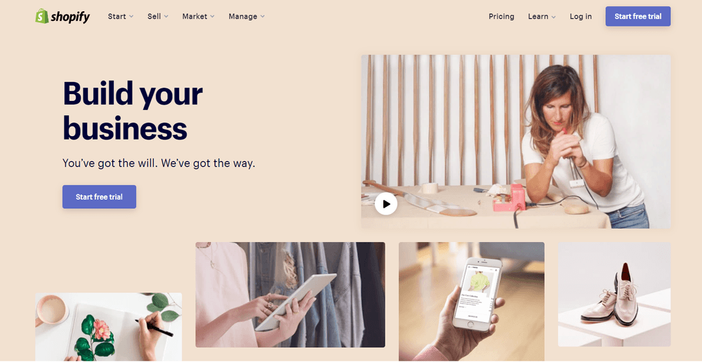
Shopify is a powerful ecommerce platform. It has a range of themes which are all designed with your products in mind, and more sales features than you can shake a stick at.
Where Shopify really excels, though, is away from your website. The platform allows you to broaden your online store’s reach by tapping into different channels, and by selling across various marketplaces and social media networks.
Here you can see how Shopify performed in our ecommerce platform testing:
Shopify is slightly different to website builders in that you predominantly work from a dashboard, rather than an editor.
Because there is so much more to consider with online stores – like marketing, inventory, and shipping – it makes sense that you have a hub to manage everything from, including your website’s design.

Further Information
- Shopify Review – Understand the power of Shopify, and what it could do for your business.
- How Does Shopify Work? – Our 9-step guide covers all the basics.
- Shopify Pricing Review – Is Shopify worth the investment?
4. Select a Template
Now you’re clear on your site’s purpose, clued up on the latest web design trends, and have a platform in mind, you should have a much better idea of what you need from a template.
A template, sometimes referred to as a theme, is the layout of your site. Think of a template like the structure of your house – it forms its basic appearance, before you fill it with all your belongings.
Most platforms will offer you a range of templates to choose from, which come pre-filled with example content.
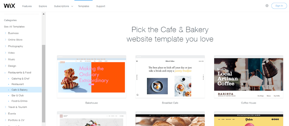
Templates are usually divided into industry categories, making it super simple to sift through them and find ones that are relevant to you. Each category will have templates with built-in features that are relevant to that industry, saving you the time and effort of adding them in later.
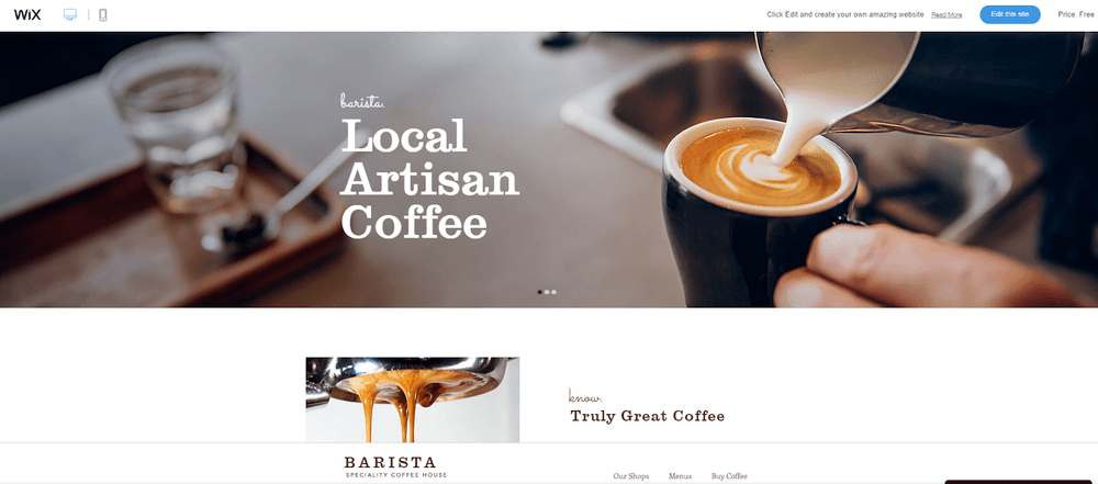
For example, if you wanted a website for your new coffee shop, you may browse the templates listed under ‘cafe’. Most of these will already have a contact form, menu page, and contact details built into the template, as they are all related to what a cafe website would require.
All templates can be previewed before you begin editing, so you can get a clear idea of what it looks like – and, more importantly, whether it fits your needs.
Rolling with the example of a coffee shop, it’s worth checking out what other cafes are doing.
Research suggests that website users find information faster by scrolling, rather than by flicking across different pages. So, if your website just needs some basic information, it may be worth considering a one-page template.
Further Information
- 3 Simple Criteria to Help You Choose Your Website Design
- Wix Templates Review – Learn what we really think of Wix’s templates.
- Squarespace Templates Review – Just how good is Squarespace’s design?
5. Decide On Your Branding
The time has come to start designing your website! Now, let’s put what we’ve learned into practice.
When designing your site, you should think about how everything you do relates to your overall brand. Everything from the color scheme to font style and imagery play a part in telling your brand’s story. It’s important they’re all sending the same message.
Color Scheme
Color is one of a brand’s biggest communication tools. In fact, according to Color Matters, a signature color can boost brand recognition by 80%.
There’s a lot of psychology behind people’s perception of color, so it’s important to understand how it’s used in relation to your industry. To help you out, here’s an infographic we’ve put together that helps explain what different colors mean and how they’re used.

Most brands have one dominant color, then two or three secondary colors. Blue is the most popular color, with one-third of the top 100 brands using it in their logo.
If you want your site to be in keeping with modern trends, then vibrant colors are the way to go. Color experts, Pantone, recently voted ‘Veri-Peri’ as color of the year for 2022:

Further Information
- How to Choose a Color for Your Website
- How to Make a Logo – The 4 best online logo makers.
Font Style
Similar to color, the font you opt for has a big impact on what people think about your website. The average website user will read about 20% of the text on any given page, so it’s crucial to entice them with an appropriate vibe.
Naturally, white-collar businesses will want to use classic styles of font. Fonts like Arial and Helvetica are synonymous with professionalism, and therefore make sense when discussing serious matters.
A more fun or playful brand, however, may wish to explore more abstract fonts. It’s important to strike a balance between interesting and readable, though – the last thing you want to do is alienate your readership.
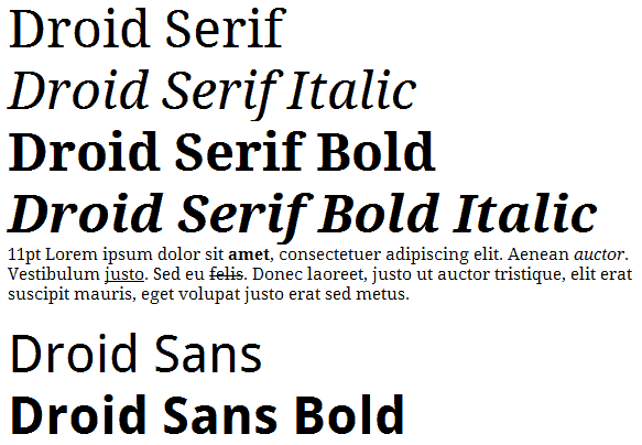
As a general rule of thumb, you should avoid using Comic Sans font. That is, unless you’re planning a kids birthday party!
Further Information
- Interested in reading in-depth about how to use different font styles? Check out our guide on how to pick the best font style for your website.
Imagery
Images are how you turn a modest website into a visual feast. Visual content is useful for increasing clicks and engagement, but on a more basic level, images simply stick in the mind. According to one study, if we hear a piece of information, we’ll only remember 10% of it – but if you add a picture, you’ll remember an incredible 65%.
That said, be careful not to overload your site with images. Lots of high-quality images might look great, but they can slow your site down. Web users are impatient, and will vote with their keyboards if your site doesn’t load quickly.
Further Information
- Where to find professional images for your website
- Free image editors we recommend
6. Optimize Your Content
So, now you know what you want to add to your website, there are two things you need to think about: positioning and optimization.
Positioning refers to where your content sits on each page, and how it’s laid out. Optimization, meanwhile, is the process of tweaking content to help it rank higher on search engines, such as Google or Bing.
Below, we’ll discuss the technicalities of both, and explain why they’re important.
Positioning
Research into reading patterns teaches us that people commonly consume content in an ‘F’ format. In simple terms, this means that website users will scan a page in a shape that resembles an F.
This picture is taken from a Neilson study, where the group tracked the eye movement of readers on a web page.
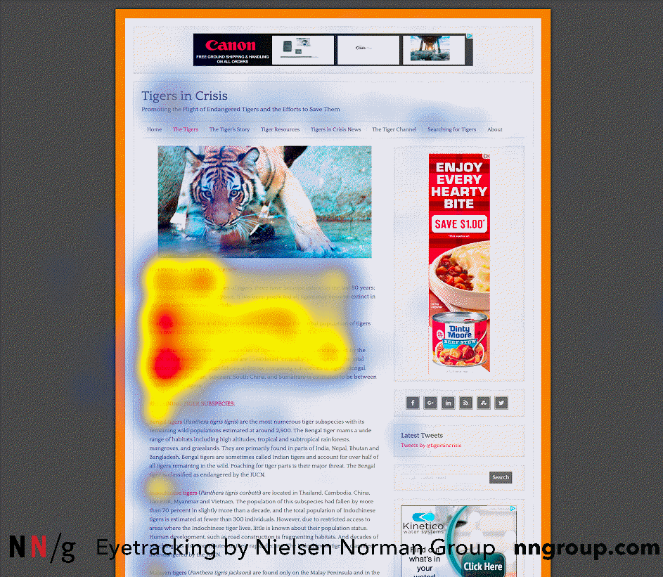
This is why navigation bars on websites are nearly always displayed across the top of the page. It’s the first thing people are drawn to when landing on the site (read up on website navigation best practices).
It’s good practice to lay out your content with this in mind, so as many people as possible see the important stuff.
Optimization
Search Engine Optimization (SEO, for short) is when you make changes to your website in order to increase the quality of it for the people landing on your pages. Think of SEO like this:
If you own a racing car, the aim is to win a race. You can have the fanciest looking car, but it’s what’s under the hood that’s going to make a difference.
When you make tweaks to the engine, replace the tyres, or lighten the chassis, what you’re doing is optimizing your car. It may look the same, but you now stand a far better chance of winning the race!
SEO is much the same. Your site may not look any different, but making tweaks to content, images, and responsiveness can have a huge effect on how highly it ranks in a search engine’s results. Wix, for example, has given its customers total control of all critical SEO elements in one place, which is great for all those minute tweaks and alterations.
Here are just a few of the most important things you can do when designing an optimized website:
Metadata
Beyond your actual content, page titles and descriptions – known as metadata – are the easiest way of telling Google what your site’s all about. Metadata appears in the search results, and allows users to discover what’s on your webpage before they click on it.

Image Compression
Images are typically quite large files. This means that having a lot of imagery can slow your site down, leading to people becoming impatient and leaving it before it’s even fully loaded. This is known as ‘bouncing’ off the page.
To put that into some context:
Webpages that have a loading time of two seconds or less have a bounce rate of 9%, compared to those which take five seconds, which have a 38% bounce rate.
Source: Unbounce
So, what can you do about it? There are tons of free online compression tools that will reduce the number of pixels in your images. And while it’s important not to distort the quality of imagery, compressing pictures can have a big impact on page loading speeds.
Image Alt Text
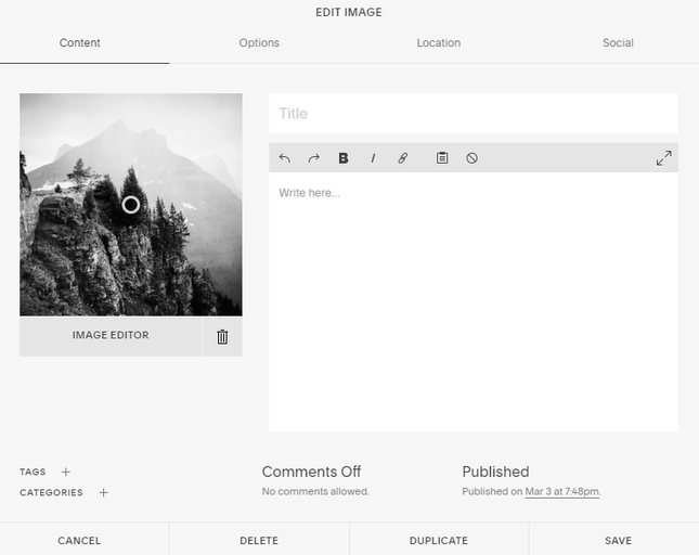
Alongside compressing images, another important part of SEO is to tell Google what an image represents. Unlike text, search engines can’t ‘read’ images, so by adding alt text to an image, you are effectively helping them understand what it being depicted.
Alt text doesn’t appear directly on your website – it’s added in when you’re editing – so you don’t need to worry too much about making it your most inspiring work (as long as it’s representative of the image.)
Further Information
- Image Optimization guide – Learn all about how to get your images ship shape for the web.
- Video SEO Optimization – Similarly videos need SEO optimization to help your web page (and video) rank well.
- Squarespace SEO Review – How to rank highly with Squarespace.
Mobile Responsiveness
This is a big one. In 2022, 59% of all internet browsing took place on mobile devices. That’s why Google favors websites that format properly on mobile. If yours doesn’t, you’ve got a serious problem.
Most templates these days are mobile responsive, and will automatically reformat your content to fit various screen sizes. It is, however, worth thinking about if you want anything to appear differently to mobile users.
Nailing this will improve your users’ experience, and earn you some serious SEO brownie points. Plus, it’s also a great way of making your website more accessible to a wider audience.
Internal Linking
Internal linking is where you direct users to another webpage on your site via a hyperlink. This is generally done when you mention something that you have related content on. This tells Google that you are an authority on the subject, since you have multiple articles about it.
Google’s ‘E.E.A.T’ guidelines stand for Experience, Expertise, Authoritativeness, and Trustworthiness. By writing in-depth about a subject and internally linking to more content related to it, you are showing search engines that you really know your stuff, which should in turn help you rank highly.
Further Information
7. Publish Your Website
You’re feeling ready to publish your website, let’s have a quick recap of what you needs doing before you hit the “Publish Site” button:
- Established your website’s purpose
- Researched the latest web design trends
- Done some competitor analysis
- Settled on a platform and theme to build your website with
- Decided on your branding (color scheme, font style etc.)
- Created your website and optimized its content
Now, it’s time to check everything works before you go live!
Ask your family, friends, and colleagues to test the site in preview mode (all website builders and ecommerce platforms will have this), and see if they find anything wrong. You can even get members of the general public to test it too, and to offer their thoughts.
Some common things to check when testing your website are:
- All your links work properly, and they direct users to the right page
- All your content is readable and easy to find
- You are never more than three clicks away from the homepage
- Your site looks great across desktop, mobile, and tablet
- Loading speeds are no more than 5 seconds on any page (use a free site speed tester to check this)
For more details, you can find loads of UX (user experience) checklists online. It’s important to be as thorough as possible before you go live. Think of it like a restaurant’s opening night:
Your restaurant interior, menu, chefs, and entertainment could all be spot on, but if you’re understaffed, it will leave a bad first impression on many customers – something that’s hard to recover from.
Always take the time to properly check your website before it goes live – first impressions count. After that, you’re ready: publish your site, and send it out into the online world!
Analyze and Improve
Congratulations! You’re now the proud owner of a live website. You can kick back and relax now, right? Well, not quite.
It’s important to keep track of how your website is performing. Without meaning to sound like a pushy personal trainer, you have to keep working and improving!
Most platforms have their own built-in analytics, or at least have an app you can install. Alternatively, you can connect your site to Google Analytics, so you can track things like:
- How many page views you’re getting
- The amount of time users are spending on each page
- What your bounce rate is
- Conversion rate (for ecommerce)
These stats, known as behavioral metrics, help give you an idea of which web pages need some attention. They also help you spot where you need to improve your SEO.
The truth is, a web designer’s job is never truly done. If you just sit back and admire your work, others will overtake you.
We’re not suggesting you need to be making by-the-minute changes, but keeping on top of your site’s performance and shifts in web design trends will go a long way.
Summary
You’re now armed with the essentials for designing websites. Let’s look at those steps one more time.
Designing Websites: The 8 Steps
- Define your site’s purpose and strategy
- Research the latest web design trends
- Choose your platform
- Select a template and start customizing
- Decide on your branding
- Add in and optimize your content
- Publish your website
- Analyze and improve
Bookmark this guide as your website design manual. That way, you can always revisit it if you’re unsure about best practice, or basic design ‘do’s’ and ‘don’ts’.
Remember: keep an artistic eye on your competitors, and don’t be afraid to learn from the best. Follow the steps in our guide, and you’ll be turning dull design into delightful browsing in no time.
Oh, and if you ever get stuck, drop a comment below – we’ll try to help you as best we can!
The truth is, a web designer’s job is never truly done. If you just sit back and admire your work, others will overtake you.
We’re not suggesting you need to be making by-the-minute changes, but keeping on top of your site’s performance and shifts in web design trends will go a long way.
More Information
- Have you considered creating a splash page for temporary promotions? Find splash page examples here.
- Want inspiration? Here are some great actor website examples
- Learn the importance of asymmetrical balance.


FAQs
If you’d rather do everything yourself and can/or are willing to learn code, you can build a site from scratch with WordPress.
The third option is you can hire a web designer to make it for you. You can draw out and design concepts while they do the actual building in code.
- Pick two or three base colors at most
- Don’t overcomplicate your design by adding too much
- Keep to a grid format to keep the design balanced
- Use relevant and good-quality graphics/images
- Keep typography and fonts consistent


24 comments