Journey Through the Best Designed Websites: Top 11 Picks
Our independent research projects and impartial reviews are funded in part by affiliate commissions, at no extra cost to our readers. Learn more
Looking to keep your website fresh and up to date? We’ve looked at the top design trends from 2023, and identified the most popular visual elements used in some of the biggest, most successful websites. Take these trends and run with them, and your website might also end up as one of the best designed websites of the year, too.
After all, if a website has a sharp appearance, smooth visual flow, and intuitive navigation, people are going to feel a lot more comfortable following it, engaging with it, and buying from it. Especially in uncertain times with costs of living rising, the easier your website feels to navigate – the better!
So read on to get acquainted with the 11 best designed websites of 2023, some of which have been built with web builders – a great tool for saving money and easily designing websites.
And remember to keep checking back – the web is always changing, so we’ll be updating this page regularly when new trends arise, or if new websites encapsulate these existing trends.
1. Girlboss
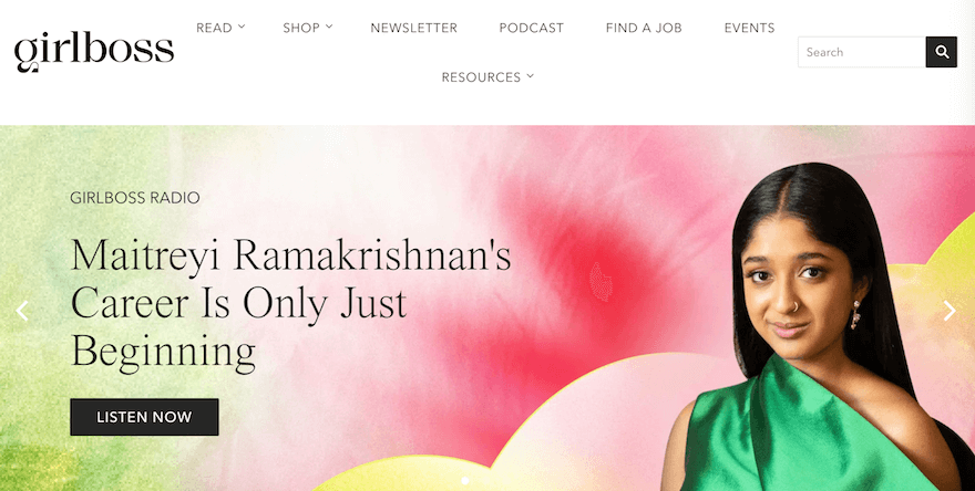
Built with Shopify, Girlboss – in its own words – is a “modern media company providing women all over the world with the tools and mindset to succeed.” That all starts in one place (its website!) and here, the design is as inspiring as the contents.
Filled with color, bold call to action (CTA) buttons – and boasting a simple, attractive UX – Girlboss’ website is designed in a way that maximizes the multitude of offerings it provides. The simple scrolling and navigation makes it easy to discover Girlboss’ mission, learn more about its radio show, and browse its range of products – all while diving deep into its range of engaging articles.
Top Tip!
It’s tempting, but don’t overcomplicate your website’s navigation! Keeping it simple, with a stripped back layout and UX, makes it easy for visitors to explore and sticks to navigation best practices.2. Swab the World
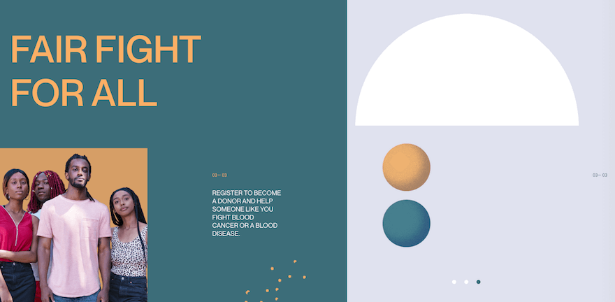
Swab the World is an organization with a noble, unique cause – empowering patients who require stem cell donations, through technology and media, to recruit suitable donors – and it has a unique, beautifully designed website to match.
Filled with images and videos of people – to humanize those the organization supports – the site also sports an extremely engaging design. There are CTAs that rotate across the screen in time with your cursor; colors that change, blinking, every second; text that slides in, then out, of frame.
Sure – Swab the World deals with a cause that can be hard to talk about. But, with its website so packed with dynamic imagery – such as shapes that bounce, shift, and shimmy as you scroll – it’s certainly easy on the eye.
Top Tip!
While there is a time and a place for dynamic imagery that hops and jives around on the screen (it can be distracting for users) doing it well creates a more engaging, immersive website experience.3. Bod Drinks
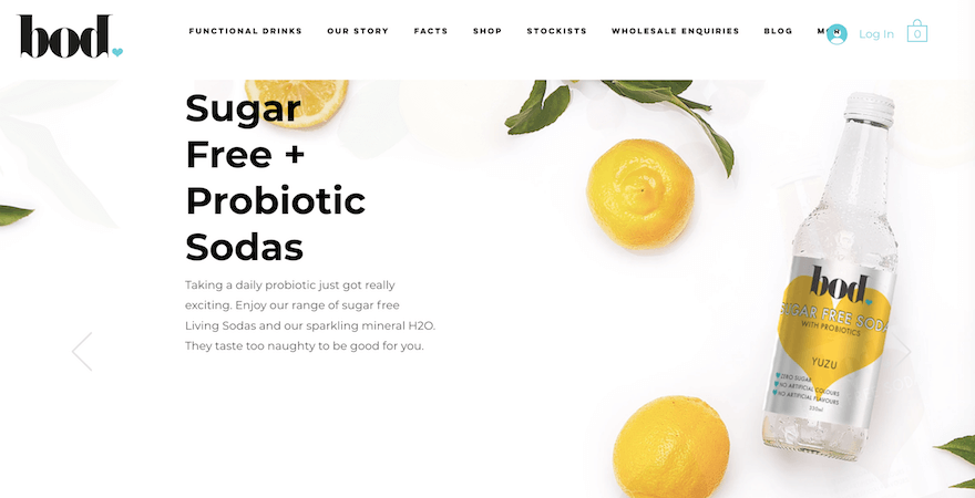
Built with popular website builder Wix, Bod Drinks specializes in “functional drinks” – probiotic sodas good for body and mind.
Design-wise, Bod Drinks’ website channels the rejuvenating, restorative principles of its wares by leaning heavily on white space – with close-up images of its drinks, and their ingredients, fading in and out of frame.
The site also uses a grid design to presents images of its drinks alongside explanations of them and their ingredients – along with bold, highly clickable CTAs imploring potential customers to view the “facts” and “buy online”. It’s the perfect balance of images, design, and copywriting to engender trust with customers – and showcase its range of delicious drinks in the best – literal and metaphorical – light.
Top Tip!
On your website, large images of your products – along with clear, transparent information about their benefits and points of difference – are excellent selling points.4. Apple
There are few brands as synonymous with sleek design as Apple. Apple plays with the idea of minimalism, but doesn’t fully commit, adding a few extra design elements – like pictures and moving menus – that aren’t strictly necessary, but still engaging and enticing.
We spoke to Ganesh, a Senior UX Architect, who said he loved Apple’s “hyper-realistic, sensational images taken from quirky angles to promote their products.” He also said “it’s the unique lighting that really makes the iPhones jump out on their website.”

Its use of soft colors is complemented by their incredibly high quality images. Apple’s products can look better online than they do in real life, which might be one of the reasons that it’s such a successful company. So if you’re selling things online, make sure to take the time to secure some flattering photos of your products!
Top Tip!
Sometimes, less really is more. And keeping your website’s design features and copy to a minimum helps your products take center stage!5. Fat Choy
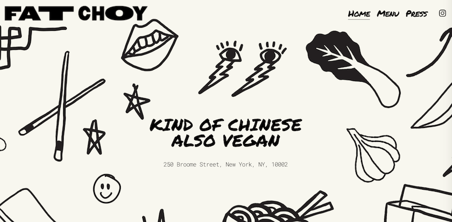
Built with Squarespace – a website builder well-known for its ability to produce stunningly designed websites – Fat Choy‘s website doesn’t disappoint.
Flaunting a backdrop filled with hand-drawn, cartoonish imagery – and the claim that the New York-based Asian-inspired restaurant is “kind of Chinese; also vegan” – Fat Choy’s website channels a playful style that never takes itself too seriously.
By showcasing its menu and images of its dishes in a large, crystal clear style that hogs attention, Fat Choy’s website does what all well-designed restaurant websites should do – get stomachs rumbling!
Top Tip!
Have some fun with your website’s design. It’ll come across to your users as they scroll and explore – because if you enjoyed making it, they’ll enjoy accessing it!6. Egg Shop
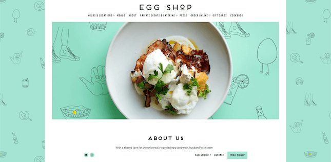
It’s not just tech that can benefit from well-thought-out photography, either. Egg Shop uses photographs of its recipes that can make anyone’s mouth water – and is living proof that you don’t need to be a tech pro to build a beautiful site.
Top Tip!
Considered photography and website imagery can bring a website to life – and you don’t need to be brimming with tech-savviness to take advantage of their impact!7. Ivy Chen
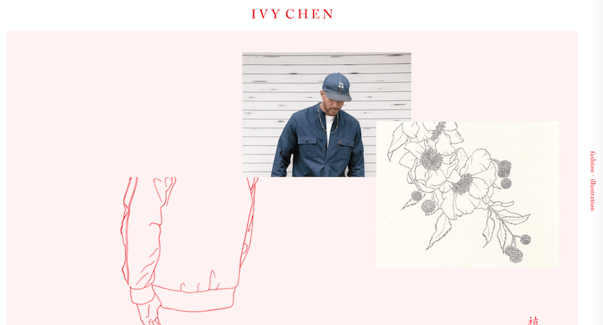
Ivy Chen‘s passion lies at the nexus of fashion and graphic design – something you don’t need to spend more than 10 seconds on her website to realize.
Built with Wix, the website’s striking design depicts drawings of outfits which, as you scroll – as if by magic – become actual outfits. It’s an excellent example of parallax scrolling (a technique involving the creation of depth and texture on a webpage by animating different elements). And, quite simply, is an absolute joy to behold.
Top Tip!
Parallax scrolling is a clever, unique way of illustrating a website in an immersive, engaging way that’ll live long in the memories of your site’s visitors.8. WeAreOSM
More and more people are accessing the web from their phones nowadays. While it’s good to have your website ironed out for desktops, if you’re looking to maximize traffic or sales, it’s just as important to make sure it’s fully functional on smartphones.
WeAreOSM is a site that’s nailed down its mobile version, with the spacing and menus being crafted to perfectly suit a mobile screen.
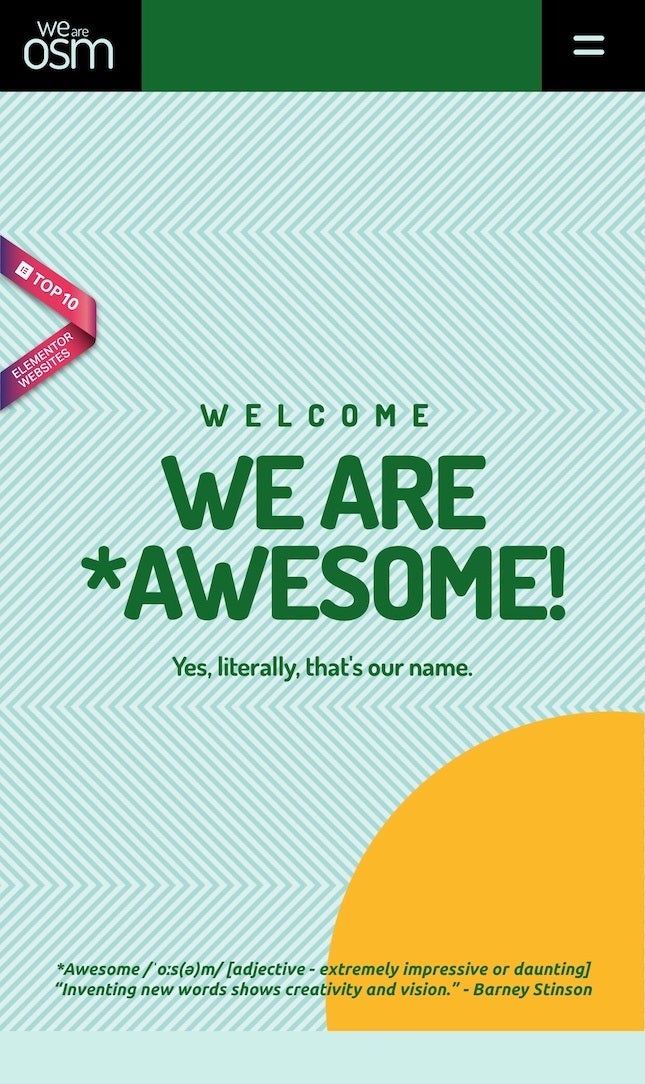
There are a few things to keep in mind when managing your site’s mobile version. Firstly, when using a website builder, make sure you pick a mobile-responsive theme. Then, when you’re designing your mobile site, keep in mind that a phone screen has a lot less real estate, so keep your text large, your menus snappy, and your display clean.
Top Tip!
Ensure your website is well optimized for mobile devices. To learn more, check out our guide on how to make your website more mobile-friendly.9. Squadeasy
Remember when the web was first starting up, and there were all kinds of websites that would interact with your cursor movements? Things like glittery GIFs following you around as you browsed the site.
As we’ve advanced, both technologically and artistically, our standards have changed. This is reflected in Squadeasy, a website focused on promoting responsible and healthy living.
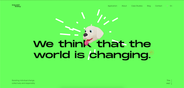
As you browse their site, the animated head of their mascot Boogie will bounce around, get dizzy if you scroll too fast, and even eat your cursor if you get too close to him. He’s in the center of the screen, but doesn’t cover up important information when looking at their case studies or information. It’s just a simple way of making your website stand out and stick in people’s memories.
Top Tip!
Adding effects to your website that respond to the movements of your visitors’ cursors are a brilliant way of having some fun with them – and giving your site that extra visual ‘edge’.10. Bruno Simon
It’s one thing to have an interactive element on your site, but it’s another thing entirely to make your site into an entire experience in itself.
Bruno Simon’s portfolio site is an example of applying an out of the box perspective to an entire website, as the navigation isn’t done by a mouse and cursor, but rather a remote control car controlled by your arrow keys.
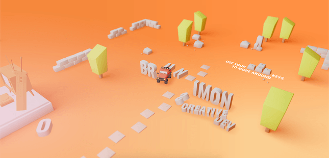
You can drive around his portfolio, go bowling, and find all his social media by driving over the correct logos. Bruno Simon is a web developer, so he shows his creativity and talent by creating a unique and engaging experience that will impress anyone looking for a designer.
Top Tip!
Be limited only by the boundaries of your own imagination. Think outside the box!11. Pioneer – Corn Revolutionized
All of these pages and tips have been shown in a vacuum, but it’s important to remember that each trend can enhance another. Look at Pioneer, a website focused on the future of corn production.
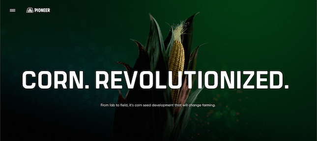
This website is undeniably an experience, with the page going through an evolution as you scroll, showing the life cycle of corn. A perfect amount of information is presented with each level, and the effects that surround your cursor as you navigate allow you to feel fully immersed in the page.
It’s hard to explain how this website blends these elements without experiencing it yourself. It’s a perfect level of information, interactive elements, and visual flair that shows how combining and keeping trends in mind can elevate your site to another level entirely.
Top Tip!
Blend information, interactive elements, and visual flair with an understanding of current trends – and you can’t go wrong!Summary of the Best Designed Websites
To wrap up, here are the eleven tips we’ve taken from our showcased websites:
- Girlboss: Keep your website’s navigation clean and simple.
- Swab the World: Use dynamic imagery to create texture and depth.
- Bod Drinks: Use copy and images to showcase your products’ best angles.
- Apple: Use high quality visuals of your product to engage your audience.
- Fat Choy: Have some fun with your website’s design!
- Egg Shop: Entice your audience with images and descriptions.
- Ivy Chen: Use parallax scrolling to create an immersive website experience.
- WeAreOSM: Keep your mobile users in mind.
- Squadeasy: Have an interactive element.
- Bruno Simon: Turn the site into an experience.
- Corn Revolutionized: Implement multiple trends at once.
Designing a website is as much of an art form as it is a technical triumph. There are a lot of routes you could take to impress your audience, so as long as you know the product or service that you’re offering, you’ll be able to use the right techniques to stand out from the rest.
Remember that everything in this article is a recent trend. Who knows what other web design trends will arise in the future? As long as you stay on top of them and take advantage of the trends that work best for you, your website will flourish.
FAQs
And, as proof that looking good doesn’t have to cost an arm and a leg, check out our comprehensive guide to the best free website templates to build your website around.
7 comments