Demystifying Color Theory: Essential Guide to Color Theory in Web Design
Our independent research projects and impartial reviews are funded in part by affiliate commissions, at no extra cost to our readers. Learn more
With so many sites online, even with helping hands from website builder templates and developer coding, it’s unsurprising that they don’t all look great. We’ve all had experience with poorly designed websites. We open them, looking to find important information or buy a product, only to be met with a confusing layout and offensive color combinations.
Needless to say, it’s a test of our patience, often resulting in us navigating away from the site to fulfill our needs elsewhere.
Yet great web design has the opposite effect. It encourages us to engage with the site, making it easy to navigate and a pleasure to interact with.
In this article, we explore an important element of web design – color theory.
When it comes to web design color theory is a set of rules that designers follow in order to communicate via appealing color schemes. Using color theory helps designers to draw the eye and tap into emotions in order to create a better, brand-appropriate website experience.
Understanding Color Theory
In this section, we explore the concept of color theory and basic principles behind it. You’ll be surprised how just a little knowledge of these will have a huge impact on your web designs.
Basic Principles of Color Theory
Before we dive into the details behind web design color theory, let’s first cover some of the basic principles behind it and what they mean:
Hue, Saturation, and Value
Hue is the term used to refer to the attribute of color. This basically means that it’s the origin of the color we see. This will always be one of the six primary or secondary colors.
The term ‘saturation’ is used to highlight the intensity and purity of the color. This can range from vibrant to dull.
Value is used to refer to the brightness of a color, representing its relative darkness or lightness.
Color Wheel & Primary/Secondary Colors
The color wheel is a circular representation of colors. It showcases their relationships and organization.
Primary colors are the foundational hues. These cannot be created by mixing other colors. The primary colors are:
- Red
- Blue
- Yellow
Secondary colors can be formed by mixing two primary colors together, such as:
- Green (yellow + blue)
- Orange (red + yellow)
- Purple (blue + red)
Warm and Cool Colors
Warm colors are colors that are typically associated with warmth. This includes red, orange, and yellow. They evoke feelings of energy, coziness, and passion.
On the other hand, cool colors are colors that are, as the name suggests, typically connected with coolness or cold. These include blue, green, and purple. These colors are typically associated with tranquility, calmness, and relaxation.
Color Harmonies and Combinations
Understanding color harmonies and combinations will help you choose an eye-catching color palette for your brand, which is important when it comes to building your website.
Complementary colors are colors that are directly opposite each other on the color wheel. When they are used together they can create a strong visual contrast. For example, red and green used together can have a big impact.
Analogous colors are colors that are adjacent to each other on the color wheel. They share similar undertones. Using them together can help create a harmonious and cohesive color scheme. For example, using orange and yellow together would be considered as using an analogous color scheme.
Triadic colors are three colors evenly spaced on the color wheel. This scheme offers a high level of contrast while maintaining harmony, helping create vibrant, dynamic designs.
Split-complementary colors are a variation of the complementary color scheme we have just discussed. In this scenario, you choose one base color and then use the two colors adjacent to its complementary color.
Tetradic colors are also often referred to as rectangular colors. This theme uses two sets of complementary colors to create a vibrant color palette with a high level of contrast.
Psychological Effects of Colors

There’s a deep psychological link between colors and emotions. Taking advantage of these connections can help you better communicate your key messages on your website.
But what does this look like in action? Let’s take red as an example. In many cultures red is deeply linked with feelings of anger. So, let’s say you’re a charity, trying to communicate a severe injustice in the world, you may strategically use the color red to help provoke key emotions within visitors.
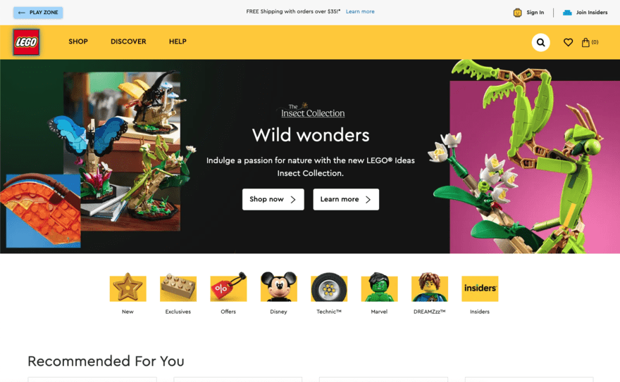
This approach is often used in branding. Brands such as IBM and Dell use blue to help provoke emotions of trust. Equally, brands such as Lego and Coca-Cola use red to provoke excitement.
Find Out More
- Learn more about Web Design Best Practices to bring your whole site in line with best practices
Applying Color Theory in Web Design
Knowing the basic principals of color theory will help you identify the correct/incorrect use of colors in web design. In this section, we look at how you can actually apply color theory best practices to your own website.
Establishing a Color Palette
You can start establishing a color palette for your website by first selecting a primary color. This will be the dominant hue that will be heavily represented throughout your website.
You may pick this based on the emotions that you are trying to communicate. Alternatively, you may already have an established primary color such as that which is used in your logo.
Your secondary colors can then be picked based on any of the color theory rules we outlined above. For example, if you’ve picked red as your primary color, and you were planing to opt for a split-complementary color scheme, your secondary colors would be yellow-green and blue-green.
Finally, you’ll want to pick ‘accent colors’. These are colors that will be used sparingly across your side to highlight specific elements. You could opt for a contrasting color that will pop against your background, or go for something analogous for a more harmonious effect.
Creating a Visual Hierarchy with Color
When it comes to websites, attention is currency.
Only when you’re able to guide visitors’ attention to the areas of your website that make an impact, such as the ‘Buy Now’ button, can you convert website visits into profit.
Creating a visual hierarchy involves strategically using color on your site to guide the visitor’s attention to specific elements. For example, you may use white space or muted tones across most of the page but use bright, bold colors in one or two key areas where you want to draw the viewer’s gaze.
Not only can this approach help you draw attention to high-value areas, but it can also guide visitors on a journey through your content.
Conveying Brand Personality Through Color
We’ve already touched on how some brands pick their logo color based on the type of personality or emotion they are trying to convey. This approach can be applied across your entire website.
However, it’s also important to be careful about color selection when it comes to emotions and brand personality. This is for two reasons:
- Each color can provoke both positive and negative emotions
- Misuse of color may be considered misleading
For example, red can be a good color to use when looking to communicate passion. However, it could also communicate anger or danger.
Equally, green can be used by brands to communicate values such as environmental friendliness. Yet, using this color when your brand is not considered environmentally friendly can be considered greenwashing.
Ensuring Color Accessibility

Ensuring accessibility helps all your visitors and potential customers to get the most from your website.
To do this, designers should select colors that maintain sufficient contrast, making content distinguishable for individuals with different types of color blindness. Additionally, designers should remember that using color alone should not be the sole means of conveying important information, as it may not be perceivable by visually impaired users.
Providing alternative cues such as text labels or patterns can enhance the accessibility and inclusivity of the design.
Find Out More
- Learn How To Make a Website Accessible for more tips on creating a more accessible online presence.
Best Practices and Trends for 2024
In this section, we will explore some recent color theory trends and best practices which you can apply to your own website.
Minimalism and Simplicity

Minimalist web design is a popular approach.
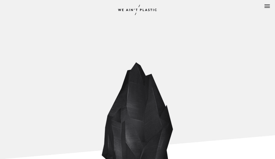
The clue is in the name. Minimalism is all about keeping your website as simple as possible. This involves removing any unneeded elements, utilizing plenty of white space, and limiting your color palette with neutral tones for a clean and easy-to-navigate look.
Bold and Vibrant Colors

This trend is a stark contrast to minimalism.
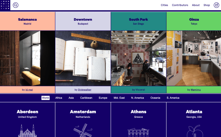
It involves using vibrant tones throughout your website design in order to make a statement. You will also find a mix-and-match approach to contrasting colors.
Although potentially a little “in your face”, this approach can be visually pleasing when done correctly.
Dark Mode Design

Dark mode flips the traditional design of black (or dark) text on a white (or light) background and instead uses a black (or dark) website background with white (or light) text.
Benefits of this approach include reducing eye strain, improved readability in low-light environments, and energy efficiency on devices with OLED screens.
Gradients and Duotones
Using gradients in your website design can be a good way to add depth and dimension, creating a visually appealing effect. For example, you may use gradients to help smoothly transition between sections of a webpage or to draw attention to one side of the page.
Duotone images and overlays use two contrasting colors to create a striking visual effect. This approach can be creatively applied to images, backgrounds, and illustrations – helping create an eye-catching aesthetic.
Summary
Color theory plays an important role in developing visually appealing and functional websites. A lack of its application can alienate visitors and lead them to seek solutions to their needs elsewhere.
From selecting the right colors to using no color (where appropriate), we’ve walked you through everything you need to know to get started with color theory. So, why not start by applying these principles to your website today?
Leave a comment