Showcasing the Best 11 Real Estate Agent Websites for 2024
Our independent research projects and impartial reviews are funded in part by affiliate commissions, at no extra cost to our readers. Learn more
Whether you’re an aspiring real estate mogul or are already established, you’ll need a tip-top website to attract new clients. Luckily, there are a ton of real estate website builders out there to help you get started.
But what makes a real estate agent website stand out from the crowd? Sleek design, easy navigation, and great imagery are a start. But instead of just telling you what you need, we’ll show you instead. Take a look at these 11 amazing real estate agent website examples that set the tone and are packed with inspiration.
1. Carrie Wells
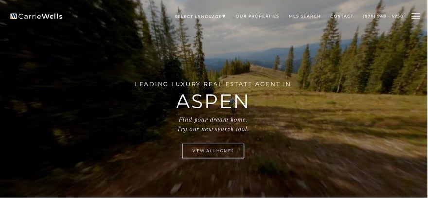
Carrie Wells’ real estate site really stands out in the world of luxury homes, especially Aspen. The design is super clean and easy to navigate, totally focused on showing off those multi-million dollar properties. A nice simple menu makes finding listings, searching, and contacting Carrie a breeze.
She’s quick to mention that she’s a top one percent agent globally and number one in all of Colorado—so you know she sells high-end homes with the best of them. And her customer service is just as good.
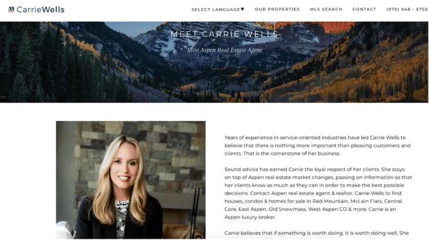
Carrie’s committed to giving people the inside scoop on the Aspen market and helping them make smart choices. Mix that with excellent photos and you’ve got a winning site for any agent aiming for the top.
2. Guy Yarkoni
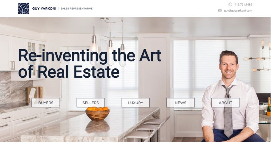
Guy Yarkoni is shaking up Toronto’s real estate game with his website. With over a decade in the business and a client-first mantra, he’s in it for the long haul with a site that displays his chops and aligns with his ethos.
The design is clean but dynamic, using a neutral color scheme that makes the property photos leap off the screen. But what really counts on Guy’s site is the user experience, and it steals the show with fluid navigation, in-depth property listings, and multimedia elements like video tours that elevate it from a mere digital business card.

So, what’s the big takeaway here? A website like Guy’s doesn’t just spotlight him. Instead, it acts as a goldmine for buyers and sellers while featuring Guy as the “go-to expert” property expert in Canada, Toronto.
3. Aaron Kirman
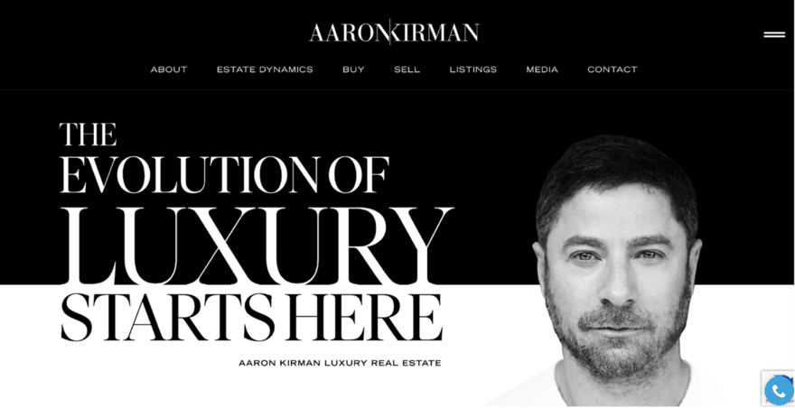
Aaron Kirman is flipping the script on real estate website design, opting for a layout that’s more akin to a glossy magazine.
The site’s black-and-white palette is a breath of fresh air in a world where most agents lean towards maximalist color schemes to highlight listings. This stark contrast sets Aaron apart and keeps your eyes glued to the screen.
It’s not just about looks, though. Aaron’s site is a masterclass in brand consistency. From the big, bold typography that shines against the background to the uniformity in color and design across all platforms – Aaron’s got the look and feel nailed down.
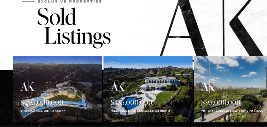
Even his domain name matches his social media handles, making the brand instantly recognizable. Aaron also makes the smart choice of highlighting the social media buttons so they’re easily noticeable, just in case you want to explore what he offers further.
If Aaron’s website teaches us anything, it’s not to be afraid to break the mold with your layout and design choices. Keep your branding tight and consistent, and don’t underestimate the power of a strong, cohesive online presence.
4. Dora Puig
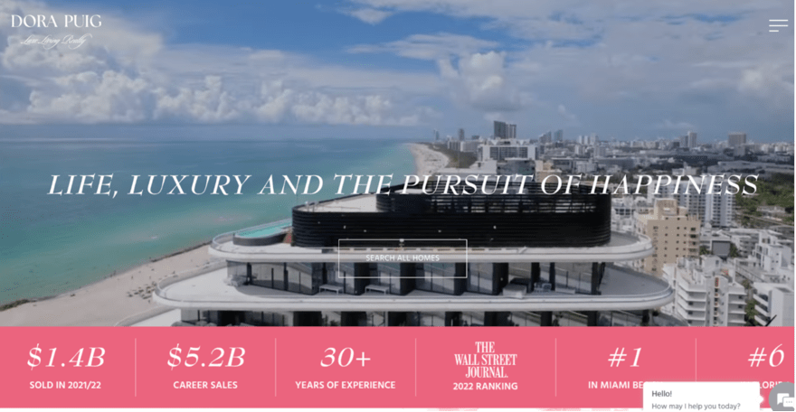
Dora Puig’s website is a luxe panorama of Miami Beach’s real estate scene and dazzles with its clean, sophisticated design, highlighting her status as a top realtor in the area. It features a digital mosaic of plush properties like the $80 million North Bay Road Estate—and it’s all there in vivid detail.
Dive deep into Miami’s neighborhoods, each painted with vibrant strokes of local lore and lifestyle, from the bohemian spirit of Coconut Grove to Coral Gables’ historic charm. You really get a feel for what the areas are like with striking imagery and descriptive text.
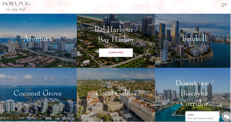
Indeed, Dora takes you on a narrative journey through Miami’s crème de la crème of properties, wrapped in a package of elegant usability and ger illustrious $5.2 billion sales feat. A true testament to luxury, expertise, and local insight, it’s a masterclass in marketing high-end real estate online.
5. Chris Cortazzo
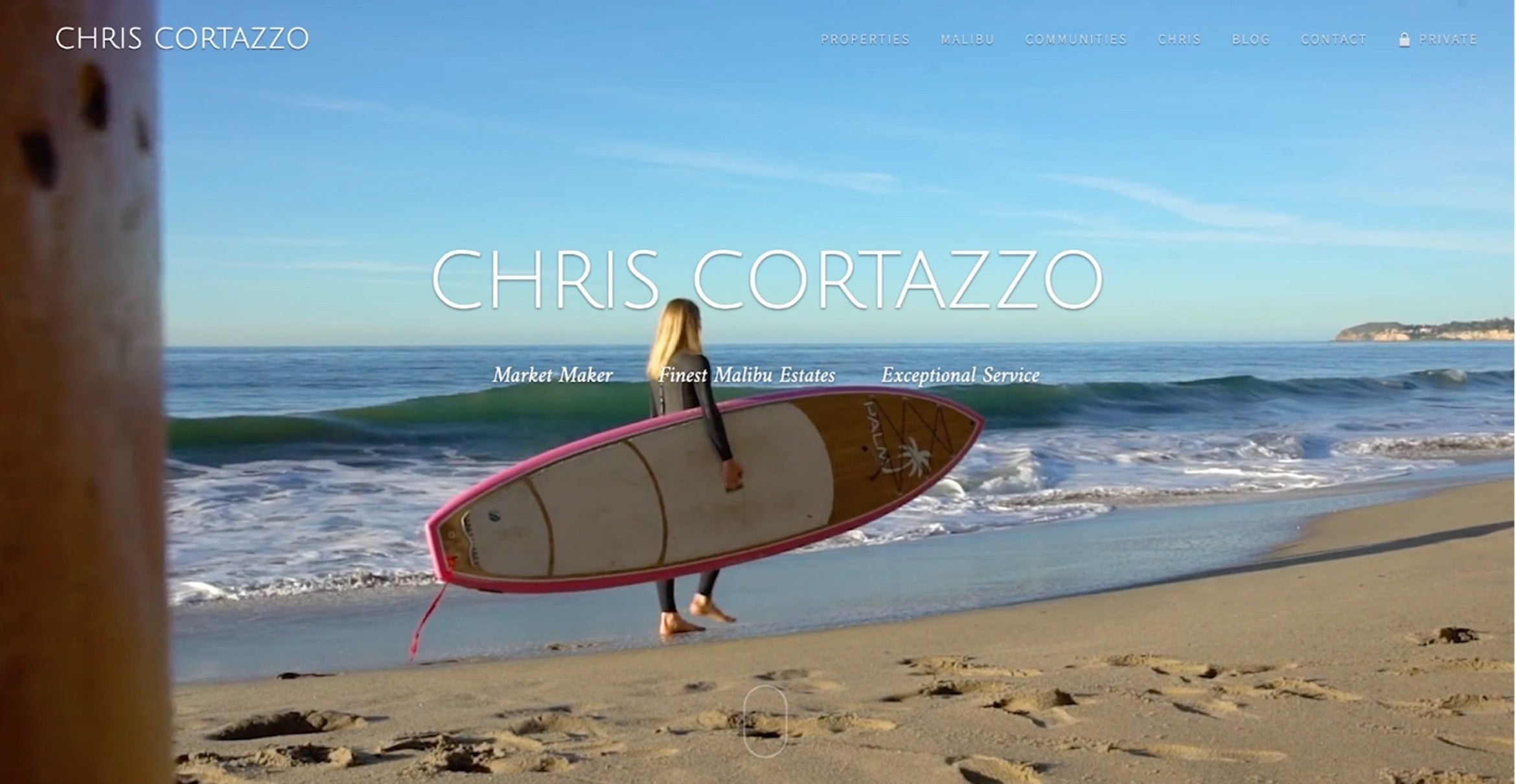
Chris Cortazzo’s site is deliberately designed to represent the luxury Malibu homes he’s selling. Everything – from the layout to the fonts and imagery – clicks together effortlessly. It’s like a well-orchestrated symphony, only for your eyes.
It all starts with the Art Deco font. How many real estate sites have you seen with the same, tired serif font? Chris breaks from the norm here, and it gives the site a unique look that stands out instantly.
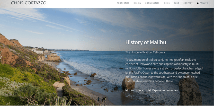
Bold choices like these, as well as a clear love for everything Malibu, elevate the entire user experience. It’s a masterclass in how to do luxury real estate web design right.
6. Debra Smalley
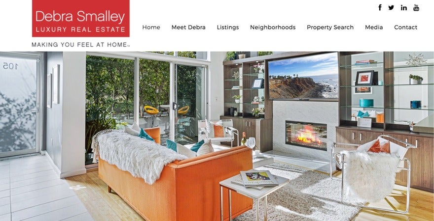
A third-gen LA local, Debra Smalley is shaking up the city’s real estate game with her combination of know-how and negotiation prowess. This is all displayed on her website, which is a sleek, minimalist gem that’s completely on-trend.
The focus here is on white space, letting those stunning property pictures and raving client testimonials really stand out. But what sets this site apart is the user experience. The listings are important, of course. But Debra takes it up a notch with a resource hub stacked with neighborhood guides and market insights.
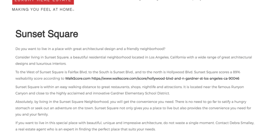
Throw in some video testimonials for that extra dash of authenticity, and you’ve got more than just a website – it’s a storytelling platform that positions Debra as the go-to LA real estate guru.
A well-crafted website like Debra’s can be a powerful tool for establishing credibility and offering value beyond the sale.
7. Darlene Streit
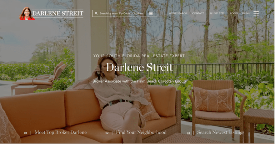
Darlene Streit’s real estate website offers a polished, sophisticated portal into the South Florida luxury real estate market. It’s a masterclass in showcasing property listings with a focus on areas like Palm Beach, Wellington, West Palm Beach, and beyond. The site’s layout and navigation are intuitively designed, making it simple for users to search for properties based on type, location, and price range.
The website’s client-centric approach is evident in its commitment to responsive, tailored service. Darlene’s ability to quickly sell properties and find perfect matches for buyers, along with her First Class Concierge service, are particularly noteworthy, enhancing the user experience significantly.
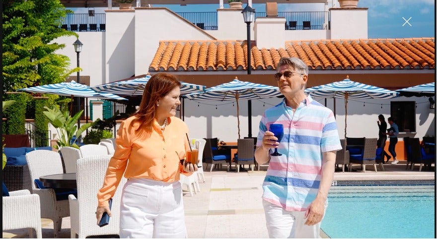
Once you’ve had a good look through the website, you’ll feel like you know Darlene personally. That’s entirely by design, and she’s done an excellent job of providing familiarity throughout the web pages. By the time you get in touch, you’ll feel like you’re catching up with a friend.
8. Sharlene Chang
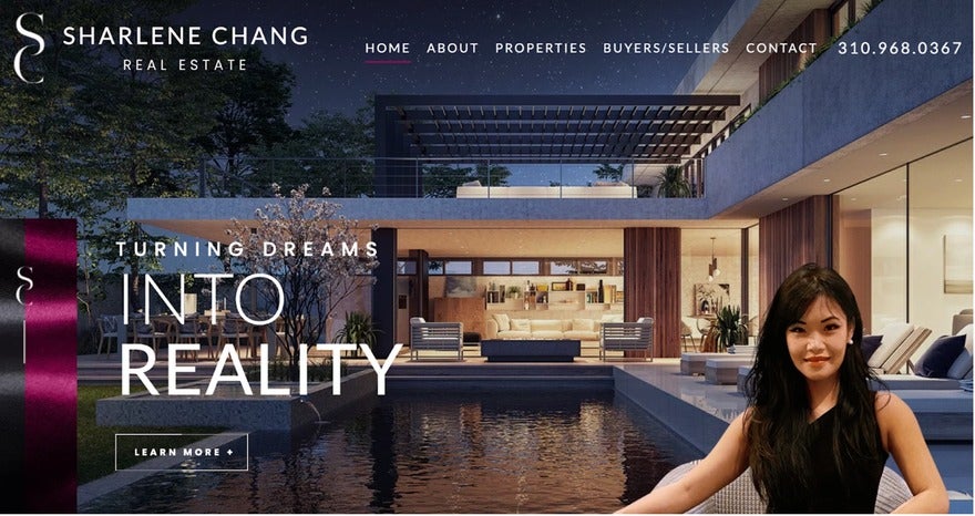
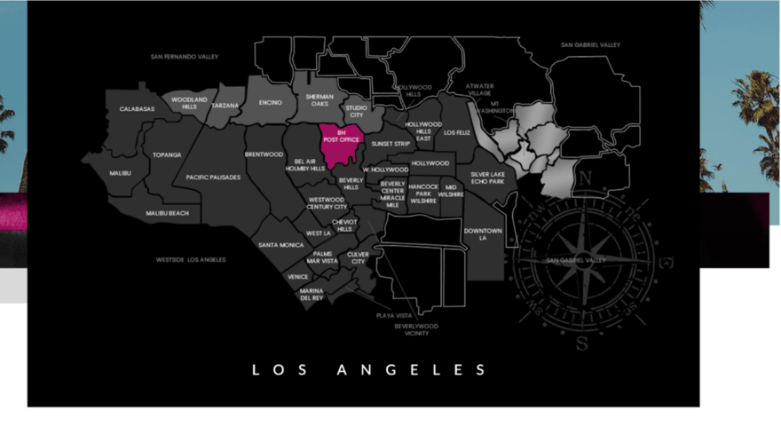
Another regular on the LA real estate scene, Sharlene Chang’s website is a love letter to the city and captures its vibrant colors, buzzing nightlife, and upscale vibe. The site’s standout feature is the interactive map that lets you explore various districts with a simple click. This saves potential clients a ton of time, allowing them to zero in on the specific neighborhoods they’re interested in.
The layout is sleek, and navigation is a breeze. The photo quality is pretty good, too, but it’s the site’s performance and load times that are truly excellent. Sharlene’s site isn’t just a place to sell properties as much as it’s a virtual tour of the LA lifestyle. Consequently, both buyers and sellers will find it a compelling platform to indulge in the luxury world of LA property.
The lesson here is always to go for a website that does more than list properties. Sharlene tells a story and offers an experience that’s executed beautifully.
9. Josh Flagg
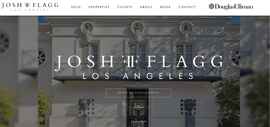
Josh Flagg is one of the most successful real estate agents in California, and as a result, he has a website that reflects that quality. He’s done so much more than just tick off a checklist when it comes to building his website and has worked to make his site a welcoming space for everyone.
His site lets you play around with language, color, and contrast settings. Readability is the key theme here, offering a personal experience for practically every user. His site is keyboard-friendly, making it a win-win for everyone—from those with limited motor skills to the keyboard fanatics among us.
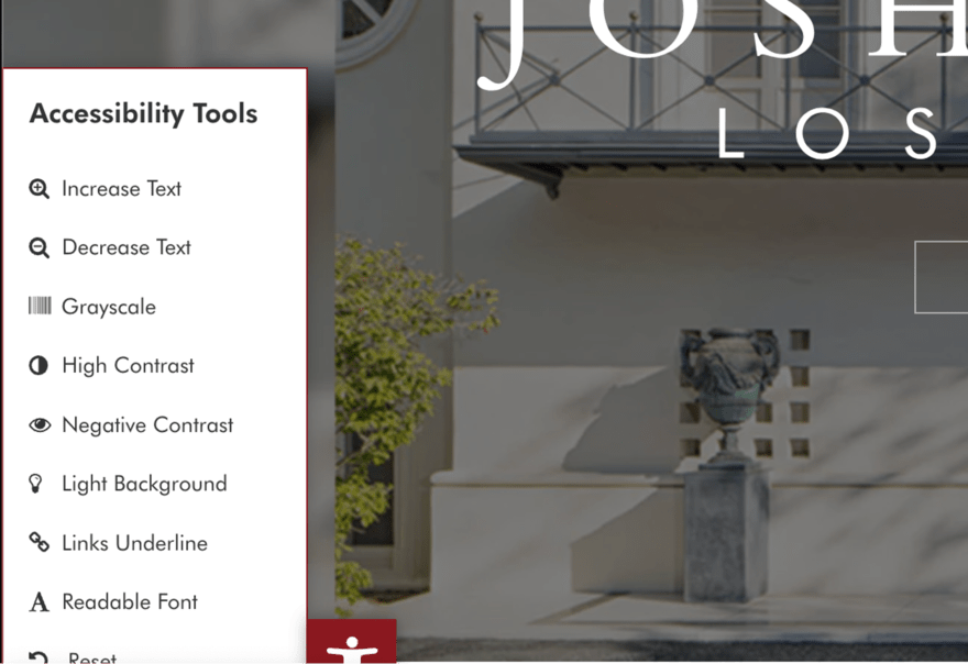
And let’s not forget he’s transparent about his focus on accessibility and even includes a statement about social responsibility. For Josh, accessibility isn’t just some trendy term. It’s a mantra, and anyone mirroring this site can make it more accessible for everyone.
The overall design and look is on-point, too. John has crafted a great-looking site, and you can see the effort he’s put in to make it feel upmarket and elegant. The refined font and pared-back, classic color scheme set the tone and reflect a feel of luxury.
10. Jamie Tian
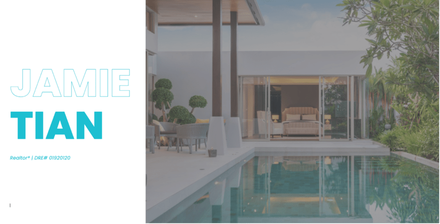
Jamie Tian has built a website that is a visual feast, thanks to its high-res images that immediately catch your eye. But what really grabs you is the pop-up form that appears as soon as you land, inviting you to sign up for weekly market updates. It’s a smart move that adds value right off the bat.
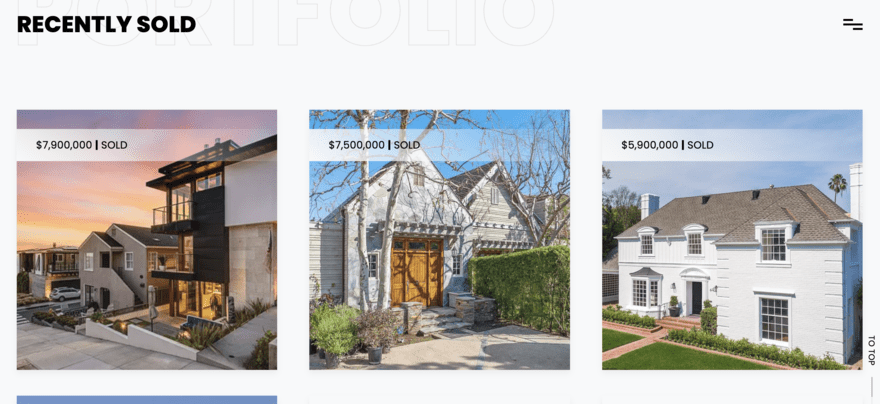
A simple menu that’s easily navigated means you’ll find everything from her agent profile and glowing testimonials to the properties she’s sold and resources for buyers and sellers. It’s all there, neatly organized and easy to find.
Jamie’s website showcases how to balance form and function to create a website that’s not just pretty but also incredibly useful.
More Information: Want more examples of seamless navigation menus? Check out our roundup of the Best Website Navigation Examples for inspiration on how to structure your own.
11. Ginger Glass

At first glance, the thick white, all caps bold copy might seem a bit much. But take a little longer to digest it, and you get the impression that Ginger Glass will go all out to get you the results you want. Indeed, the theme of the site is that you’re dealing with the best of the best when using Ginger to sell your home.
Her website is also a one-pager that doesn’t overcomplicate things. There are four main buttons: properties, record sales, Ginger, and contact. If you want to know her credentials, head over the Ginger tab, where you can find out about her 20 years of experience.

The sight also loads quickly and is easy to navigate. Sometimes it’s not about being flashy as much as it’s about getting to the point and letting people know who you are, what you stand for, and most importantly, how you can help. Ginger Glass is a fine example of all three, and her no bells and whistles website gives the impression that she means business.
Trends in Real Estate Agent Website Design
The world of real estate websites is full of innovation, as you can see from these examples. And with advancements in technology, we can expect to see even more dynamic websites coming our way. Here’s what’s trending in real estate website design right now.
Virtual and 3D Tours
Virtual tours and 3D property views are very much the here and now and a top trend. Homebuyers can now walk through their dream house without leaving their couch. It’s great to use as an initial viewing tactic. The experience is immersive, interactive, and changing the game for online property browsing.
Chatbots and AI
Say hello to your new 24/7 concierge. Chatbots and AI-powered customer support are on the rise, offering instant answers that go beyond basic responses to make the whole property-search journey more seamless.
Personalization
Many modern real estate websites are getting smarter, using algorithms to suggest properties that match the user’s lifestyle and preferences. The entire experience is becoming increasingly personal, which helps with engagement and the amount of time people spend on the site looking for property.
Video Content
Videos are taking center stage, offering everything from agent intros to neighborhood tours. It’s a dynamic way to get a feel for the property and the community, adding another layer to online searches. Just make sure you follow video optimization best practices!
Sustainability
Last but not least, green is the new black. Sustainability is making its mark, with eco-friendly design elements and property features becoming the norm. Homes that are good for the planet are right at the top of many buyer lists, and offering eco-friendly homes can add a new string to your bow.
Summary: Best 11 Real Estate Agent Websites
That’s your whirlwind tour of 11 standout real estate agent websites, each bringing its own unique flair to the digital property market. It just goes to show that a strong online presence is a necessity for real estate agents and often the first impression people will have of you.
So go ahead, draw inspiration from these great examples, and get ready to make your own mark online.
Leave a comment