10 Website Navigation Examples
Our independent research projects and impartial reviews are funded in part by affiliate commissions, at no extra cost to our readers. Learn more
When designing your website the first things you might think about are what it will look like and the content it will include.
The navigation of your website is often an afterthought, but it shouldn’t be.
Website navigation majorly impacts the overall user experience (UX) of your website and a bad UX can increase bounce rates, lower conversions, and impact the success of your SEO strategy.
Good website navigation is therefore essential.
Luckily for you, we’ve put together 10 of the best website navigation examples from an array of different websites on the internet to help inspire your website design.
How to Plan For Your Website Navigation?
Website navigation is the process of discovering and journeying through different pages of a website.
Most users will land initially on your homepage and your website navigation will help them to find the content they’re looking for that may be located on other pages.
Websites use hyperlinks to connect one webpage to another, allowing users to easily click on an internal link (using anchor text) to move to another webpage within the URL.
The best websites will use a menu with internal links to help users navigate around their different web pages.
Website navigation is crucial to creating a good user experience. When a user lands on your website they need to be able to easily move around the pages hosted on your domain, allowing them to discover new content.
If a user finds your website too tricky to navigate, they will simply leave and find a better alternative. No matter how good your website content is, bad navigation will let it down.
The key to planning your website navigation is organizing your content. If you run a travel blog, for example, there’s no point in having two pages that feature content on Paris. Users won’t know which one to select. Instead, you want to organize all of your Paris content into its own sub-category that users can easily find.
You also need to think about the overall structure of your website and the hierarchy of your content. It’s a good idea to create a sitemap that allows you to easily map out how users will move from one page to the next, and the correct order for your pages and content to be delivered in.
And finally, you’ll need to determine how you want the navigation menu to look. You can choose different colors and fonts that match your brand as well as different designs that work in various ways. We’ve got more information on the different types of navigation menus later in the article!
All the best website navigation menu examples are simple, accessible, and responsive. Try to flatten your site structure as much as possible to help users navigate around your website easily. Too many options in a menu navigation bar can be overwhelming.
We have an entire article dedicated to website navigation best practices, so be sure to check it out.
Types of Website Navigation
When it comes to choosing the type of website navigation bar you want for your website, you have plenty of options. We’ve listed some of the most popular website navigation types below:
Mega drop downs – Mega drop downs are large menu panels that, as the name suggests, drop down from the global menu header at the top of a website. These are particularly useful for websites that have a large number of pages but want to keep the main menu header sleek, such as ecommerce sites.
Top menu vs footer menu – Top menus run along the top of the webpage and are perhaps the most common type of website navigation. Footer menus meanwhile are, you guessed it, placed in the footer of the website. Footer menus are great for websites that have additional content to link to that might not be crucial to all visitors such as security options and returns information.
Sidebars – Sidebar menus appear at the side of the web page and run horizontally alongside the content. They are particularly useful for blogs and article-based websites as they allow you to direct users to similar content as they read the article.
Breadcrumbs – Breadcrumbs are hierarchical links that show pages that have been sub-categorized or nestled into others. For example on an ecommerce website, the main menu may list “skincare” but the breadcrumbs allow you to navigate further with options such as “moisturizer”, “face oils”, and “cleanser” etc.
Sticky navigation/fixed navigation – Sticky navigation bars do not disappear when a user scrolls down the webpage. Instead, they stay “fixed” to the top of the page, making navigation easy no matter where on the page a user is.
Vertical vs horizontal navigation – While traditionally websites will often feature their navigation bar horizontally across the top of their page, corporate or portfolio websites often opt for a vertical navigation bar instead.
Primary vs secondary navigation – Primary navigation bars usually feature the key content that your users will be looking for and are placed either at the top or along the side of the webpage. Secondary navigation elements can appear anywhere on the page and direct users to further content hosted on the URL.
To get some ideas about how your menu navigation choices impact your web design, why not take a look at our list of the best designed websites? And to stay up to date on the latest styles and techniques, our overview of web design trends?
10 Website Navigation Examples:
Below we’ve listed some of our favorite website navigation bar examples to help inspire your website design.
#1 Freemans Restaurant
Built With: Squarespace
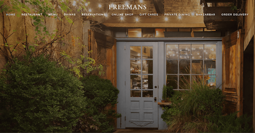
The Freemans Restaurant website highlights how a food venue can make use of engaging website navigation.
The menu header is overlaid on top of the main header image of the restaurant, making it part of the homepage rather than its own standalone feature.
While some of the menu options navigate to a specific section of the homepage, others direct users to a new page, keeping navigation interesting.
#2 William Lachance
Built With: Wix
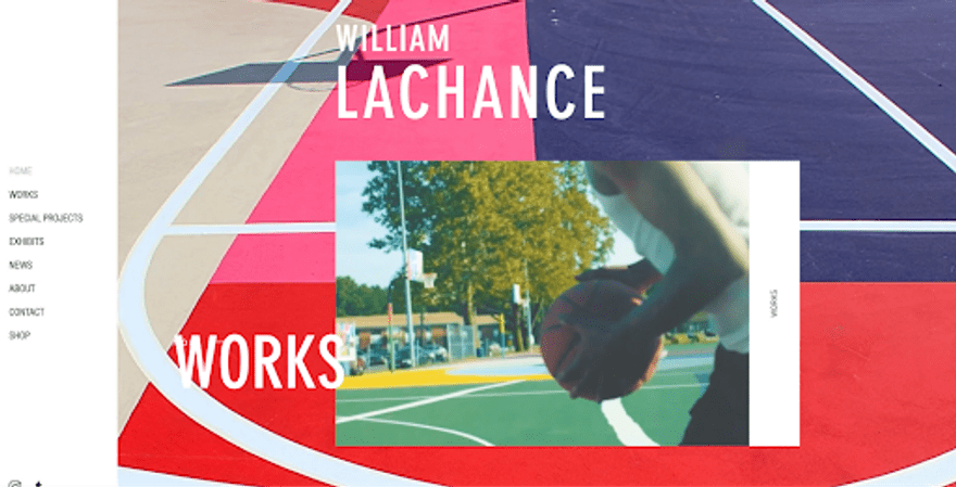
William Lachance is an artists portfolio website that uses its menu in a creative way to showcase the artist’s talents.
While there is a classic sidebar as the primary menu that features the key navigational elements, a secondary navigation menu that includes animations and videos comes into view as you scroll through the homepage.
This website uses the navigational elements to grab users’ attention and showcase its service offerings.
#3 I Love Dust
Built With: Wix
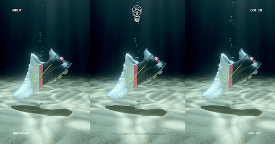
I Love Dust‘s main landing page for the website is an engaging and eye-catching video that showcases the digital agency’s work.
In contrast, it keeps its menu incredibly simple and opts to include just four navigation options, each positioned in a different corner of the website. The navigation elements remain static as you move through the website.
This design feature is particularly on-trend and helps to add a unique element to your website.
#4 Doris Liou
Built With: Wix
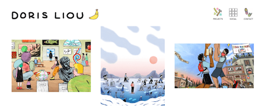
The menu navigation bar for this illustrator’s portfolio website, Doris Liou couldn’t be more perfect.
Each menu option features a hand-drawn illustration, mirroring the style of those on display throughout the portfolio.
Even more exciting, when a user hovers over a menu option, the illustrations “come to life” thanks to clever animation and GIFs.
This menu style is perfect to not only engage visitors but further showcase the quality of the illustrator’s work to potential clients.
#5 Roee Ben Yehuda
Built With: Wix
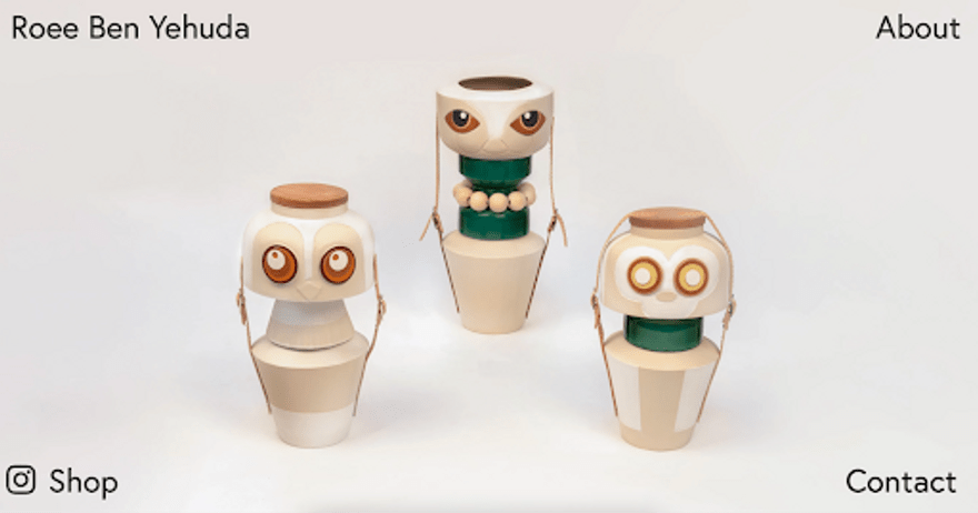
Roee Ben Yehuda is another website that utilizes a four-corner menu design, making the website fresh and on-trend.
The purpose of Roee Ben Yehuda is to showcase the artist’s work, and by placing the menu elements discreetly in the four corners, it ensures that the user’s sole focus is on the artwork.
A four-corner menu navigation adds a fun element to the website, which mirrors the novelty and child-like feel of the artist’s work. This is another great example of a website using its menu as an extension of its brand.
#6 Marketing Week
Built With: WordPress
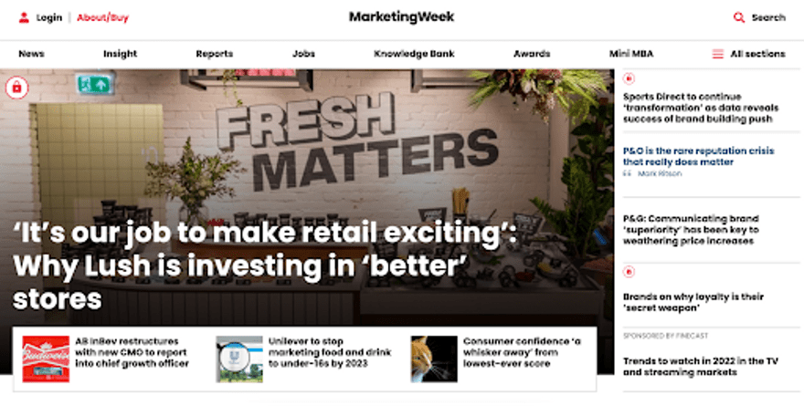
The Marketing Week website is jam-packed with content, therefore it needs strong menu navigation. Luckily that’s exactly what it has.
The website features a traditional horizontal menu bar that includes all of the key content sub-categories. But for users who want an even more in-depth navigation system, there’s also a burger menu that drops down to reveal hundreds of sub-categories and pages.
With so much content on the website, it would be easy for users to get lost, which is why the website also features sidebars and secondary menus throughout.
#7 Paid to Exist

Built With: WordPress
Paid to Exist is all about providing users with the tools and information they need to live their dream life.
The navigation menu is simple, yet effective. With various resources available, users navigate the website based on their goals rather than through individual pages of content.
For example, the main menu header includes the option “Your Goal Is..” When a user hovers over this a drop down menu appears with different options including “Find My Passion” and “Be More Productive.”
This user-centric approach to navigation puts the user’s needs first and ensures that they land on the pages that will best suit their needs.
#8 Soylent
Built With: Shopify
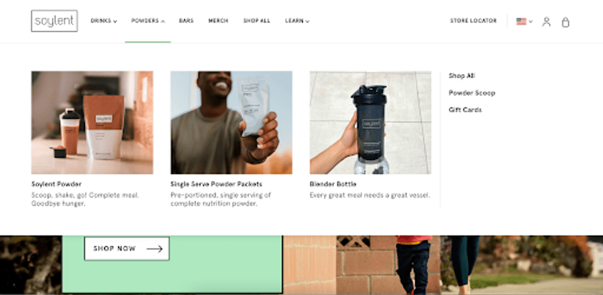
Soylent is a great example of how ecommerce websites can utilize their website navigation to their advantage.
With an array of plant-based nutrition drinks and bars available, the main menu categorizes the products into product types.
What makes the navigation of this website so clever, however, is the drop down menu that not only includes links to sub-pages, but product imagery too.
Using images within menu navigation bars is a great way to entice customers and ensure users are navigating to the right product pages.
#9 Polaroid

Built With: Shopify
As a major global brand, it’s no surprise that Polaroid has smashed its website navigation.
Known around the world for its cameras and camera equipment, Polaroid lets its products do the talking, even with its menu navigation bar.
When a user hovers over an option in the main menu navigation bar, a drop down menu will reveal the most popular items within that category, complete with a picture.
This is not only a great navigational element but also a great sales tactic, because it automatically directs customers to the brand’s most popular items.
For many users who may not know the name of the camera they are looking for, the use of images within the menu navigation makes using and shopping on the Polaroid website even easier.
#10 Harper Wilde
Built With: Shopify
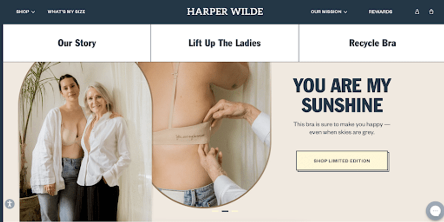
Harper Wilde is an ecommerce store that uses its website navigation menu to not only direct users to its products, but to showcase its mission and the added value it provides.
While hovering over the shop section will direct users to product pages, the menu also features key elements including “What’s my size?” and “Our mission”.
By including these in its primary menu bar, Harper Wilde highlights to the user how important the mission behind the brand is, and encourages customers to feel valued by the brand.
Unlike many ecommerce websites that use their menu to simply list products, Harper Wilde steps away from tradition and encourages visitors to learn more about the brand before they make a purchase.
Website Navigation Examples: Summary
Strong website navigation is crucial to creating a good user experience for your website, but as you can see from these examples, it doesn’t have to be boring.
From sticky and fixed menus to sidebars, including imagery or even trend-led ideas such as four-corner designs, there are various ways that you can make the navigation of your website both functional and engaging.
If you’ve been inspired by some of these examples and you think you’re ready to begin building your own website, then make sure you read our guide on how to create a website, and what the best website builders are before you get started. If a blog is what you have in mind, we have a dedicated blog creation guide.
For more design tips, take a look at our guide on how to choose a color scheme for your site. For more inspiration, take a look at our best startup website examples.
Don’t forget to come back and let us know in the comments which navigation option you choose and which of these examples you liked the best!
Leave a comment