15 Inspiring Product Page Design Examples to Help You Create Yours
Our independent research projects and impartial reviews are funded in part by affiliate commissions, at no extra cost to our readers. Learn more
So you’re setting up your own online store – congratulations!
There are many steps to ecommerce success, from choosing a good ecommerce website builder, to using high quality products, and crafting a beautiful landing page – but one of the most important ingredients is a well designed product page. Without this essential, even the hottest products will fail to sell.
Why is product page design so important? Well, on average, only 3% of online store visits result in a purchase* – and a whopping 69% of shopping carts end up abandoned**.
To fight back against these less than appealing stats, you need to give shoppers the smoothest journey to checkout possible. But what you also need? Some inspiration.
That’s why below, we’ve pulled together 15 of the very best product pages from online stores across the web. Some of them champion product videos, while others rethink how to display product recommendations – either way, they all succeed in creating truly awesome product pages.
Then, we’ll provide our top product page best practices – and walk you through exactly how to lay your product page out.
1. Bellroy
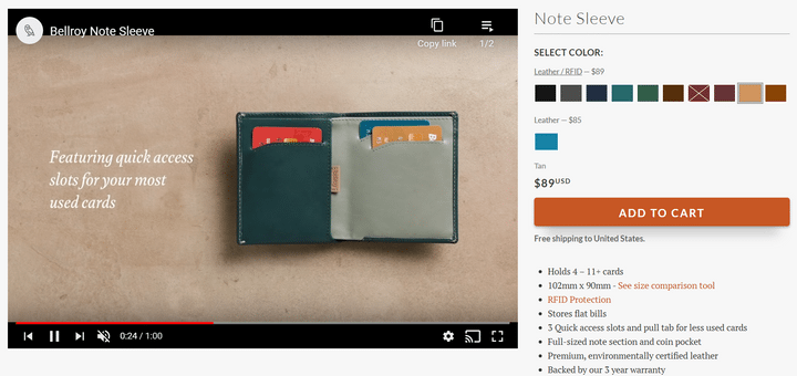
Bellroy goes straight in with an auto-playing product video, instead of the traditional product image. It does a great job of giving the customer all the essential information above the fold, without cluttering the product page.
2. Nordstrom
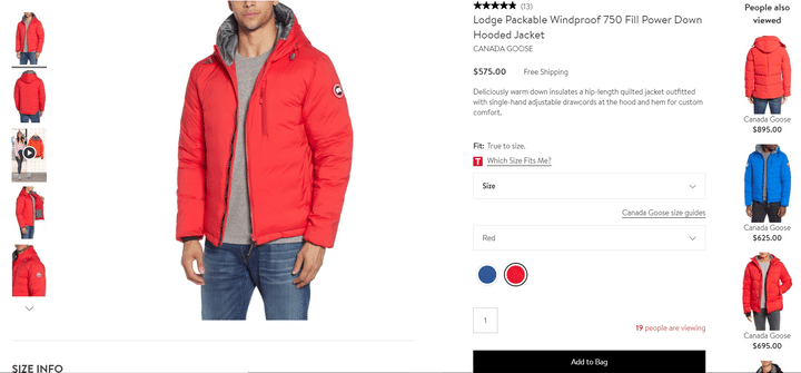
Nordstrom goes out of its way to help the customer make the best decision, from providing extra fitting information, to an interactive “Which size fits me?” quiz. The “People also viewed” section on the right-hand side and the number of other shoppers viewing the item provide great social proof.
3. Fabletics
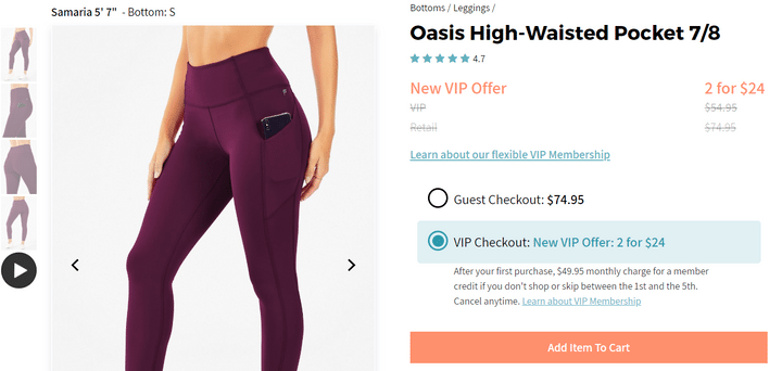
Fabletics gives clear information about what size the model is wearing, and provides context within the photo highlighting the main benefit of the product – the fact that it has pockets! Offering cheaper pricing for VIP members encourages sign-ups, and the call-to-action stands out without being too shouty.
4. Big Wild Thought
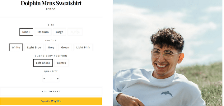
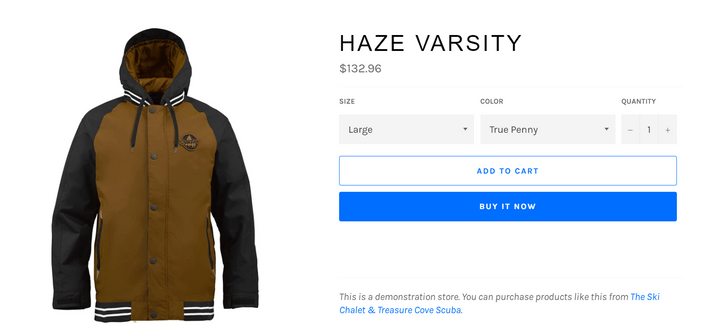
Big Wild Thought mixes up its product page design by placing the product photo on the left, and having customization options on the left-hand side. The use of buttons makes picking your product super easy, while the option to add to basket or buy instantly with PayPal is a great way to reduce abandoned carts!
5. Modcloth
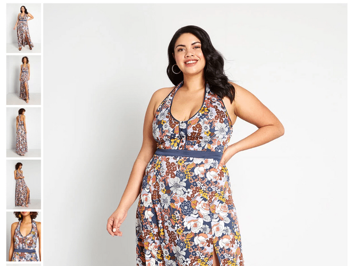
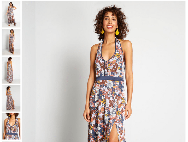
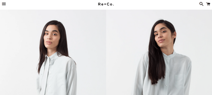
Modcloth‘s product page showcases different sized models, from multiple angles – keeping things engaging, and allowing its page’s visitors to get a sense of how Modcloth’s wares will look on them.
6. Made.com
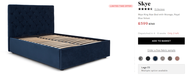
Made.com is an excellent example of why clear pricing is so important on a product page. Made.com displays large pricing high up on the page – and makes it easy to understand exactly how much its products cost.
7. Netflix

Netflix employs the perfect use of color and visuals to make its call-to-actions (CTAs) stand out – and implore its customers to get watching.
By setting its CTAs against a dynamic backdrop – a slowly revolving list of the various films and TV series Netflix has to offer – the streaming giant wraps its users up in a warm, fuzzy layer of persuasion. Getting them thinking about what they’d be watching if they had Netflix…and that all they have to do is sign up!
8. Lush
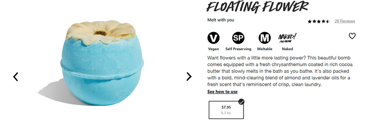
Lush makes an effort to get to knowing its audience, while getting creative to help customers imagine the product through its website. Through the relatable, conversational style of the copy, uncomplicated product page look and feel, and clear product images and description, Lush makes the buying experience both splendid and straightforward.
9. Amazon
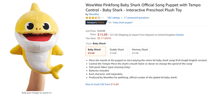
Amazon is, arguably, the most notable example of an ecommerce brand which puts customer ratings and reviews at the heart of its product pages.
At a glance, you can see instantly how popular the product is with its audience, and how many unanswered customer questions it has. Amazon also harnesses its own endorsement mini-banners (in our example, “Amazon’s Choice”) to offer another layer of social proof, and help prospective customers over that final barrier to conversion.
10. ASOS
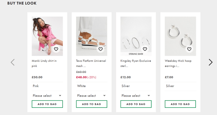
When it comes to using product pages to provide a source of accurate, relevant product recommendations, we’ll say ASOS is doing it best – because we can’t put Amazon twice!
That said, ASOS’s product pages are beautiful. With buttons to ‘heart’ each product, they encourage engagement – inviting the potential customer to not only buy the things they love, but interact with them on a dynamic level: saving them to explore in greater detail later.
11. Target
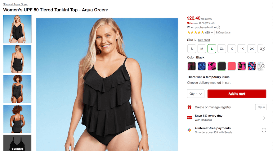
Ecommerce giant Target didn’t achieve the size – and influence – it has by having lackuster product pages. Quite the opposite!
Target’s product pages make it easy to toggle between sizes, select quantity, and add a product to the cart. Its pricing and payment options are clear, as are the photos. Better still (and as you can see in the product page featured here, a swimsuit), Target’s product pages utilize multiple models, with different skin colors – ensuring diversity in representation.
12. Apple
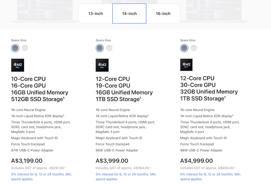
We know what you’re thinking. Amazon, ASOS – now Apple? Well, the fact of the matter is that these companies are big for a reason – and in Apple’s case, that has a lot to do with its excellent product pages.
Apple‘s product pages allow the potential customer to, essentially, personalize their product to their liking. In the case of its MacBook product, a user can select their computer’s size and color, before easily comparing and contrasting the features, capabilities (and prices!) of different models. There’s even an option to chat with a ‘Mac Specialist’ if the customer gets stuck!
13. Walmart
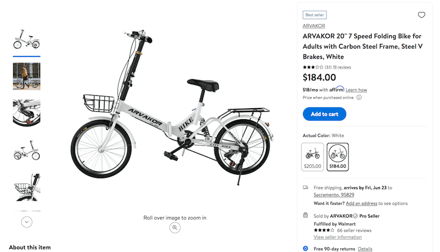
For a company that sells pretty much every item you could imagine, Walmart‘s product pages are surprisingly simple and stripped-back. Its photo selection, rollover, and zoom-in tool is slick, and toggling between different product size, model and style variations is equally seamless.
14. iHerb
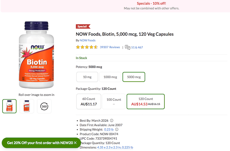
Popular health supplement provider iHerb has a name inspired by Apple – and a product page that’s in a similarly impressive ballpark, too.
iHerb places social proof – in the form of customer ratings and comments – immediately below the product’s name. Its product page also makes the finer product details (the ‘small print’) clear and transparent – something vital in the heavily regulated, oft-controversial supplements sector.
15. Zara
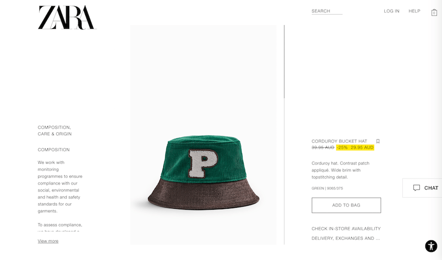
Zara‘s product pages don’t simply offer a good user experience – they’re works of art.
Leaning heavily on the principle that less is more – and that plenty of white space is absolutely paramount – Zara keeps the words to a minimum, and lets beautiful, full-length product images do the talking. Aside from the product – in our example, a green corduroy bucket hat – the only color on the page bar white is a thin band of yellow, highlighting a discount.
It’s a classy, understated product page – and should offer all the right kinds of inspo!
Product Page Best Practices
Now you’re feeling inspired, it’s time to see how you can optimize your own product page design by putting these tips into action. We’ve compiled seven of the best practices for designing product pages below. Let’s take a look!
Use High Quality Product Images
The first thing you tend to think of when planning a product page is product photos, and for good reason. Product photos are one of the most important features of any product page – think of them as the foundations of your product page design.
Customers want to know exactly what it is they’re buying – they can’t pick up your products and look at them as if they were in a real-life store, but they can look through your product photos.
The better your product photos are, the harder they work for you in persuading customers that this is the product for them, and the easier your job becomes. We’ll walk you through the golden rules of making the most of your product photos – simply click the + icons below!
Imagine trying to buy a jumper, but the product photo is dark and blurry. You can’t see any details because it’s so pixelated, and the product itself doesn’t look attractive because it’s all grainy. Would you click buy? Probably not!
Make sure your photos are:
- Crystal clear, rather than fuzzy or cheap-looking
- A good size, rather than small and cluttered
- Customized, rather than stock photos
- Consistent in size and quality across all your product pages
Okay, so you like the look of the jumper you’re thinking of buying. But there’s only one photo of it, from the front. What does the back look like? Does it have any buttons or other colors anywhere else?
Without more product photos taken from different angles, customers have no way of knowing what the rest of the product looks like. Half of online consumers say they want to see three to five photos, from various angles – and it’s worth listening to them!
To inspire excitement and confidence in your customers, you need to give them the full picture. You can either do this through 360° views (where the customer can spin the product), or simply by photographing the product from multiple angles.
If you choose the second option, put yourself in the customer’s place and think about what they need to see. If you’re selling shoes, for example, don’t forget to take a photo from above and below; if you’re selling bags, remember to include a photo of the inside as well.
Does your product come in different color options or patterns? Don’t leave it to the customer to try and imagine what the red jumper might look like versus the blue jumper – show them!
Being able to see the different options clearly will help the customer to imagine using or wearing that product, rather than simply picking a color from a tiny selector box.
By providing the customer with a full product view of each color or pattern variant, it shows them exactly what to expect, boosting their confidence that yes, they want the bright yellow zig-zag jumper instead of the plain gray one.
One of the best ways to show customers exactly what they’re getting is to take up-close, detailed shots of your products. This is especially useful to show off the texture, pattern, or quality of your items, and can really help to give a realistic feel of the product.
Another way of doing this is to provide a zoom option, where customers can hover over parts of the product they want to see more clearly.
“Model is six foot one and wears a size two.” Sure, you might think, of course this jumper is going to look great on her – but what about me?
If you have the resource, it’s a great idea to show your products in context. For starters, you should always use models who represent your target audience, but it can also help to show how your products look when worn by different shapes and sizes.
That means having photos of the size six jumper, but also the size sixteen – this will clear up any doubts that customers might have about whether the product will look good on them!
You can apply this idea to other products aside from fashion, too – for example, if you’re selling lamps, don’t just show it on a pristine white surface. Put it in a real room so that people can picture how it would look in their own homes.
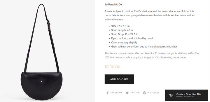
Another important way of showing context is size. For example, this product could be a hand-held wallet, or a large purse – there’s nothing to indicate size at all:
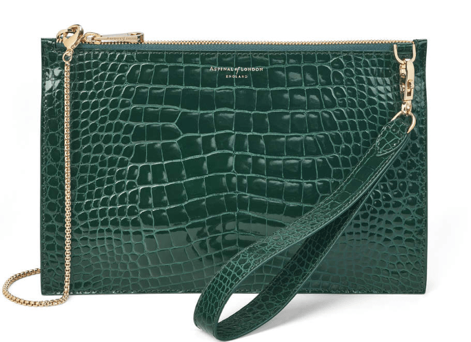
That’s why adding context is so important – once you see it being held by a person, it all becomes clear!
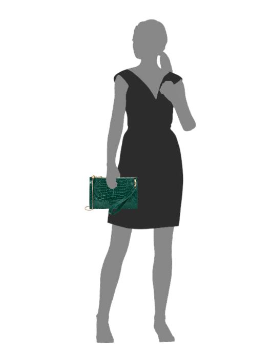
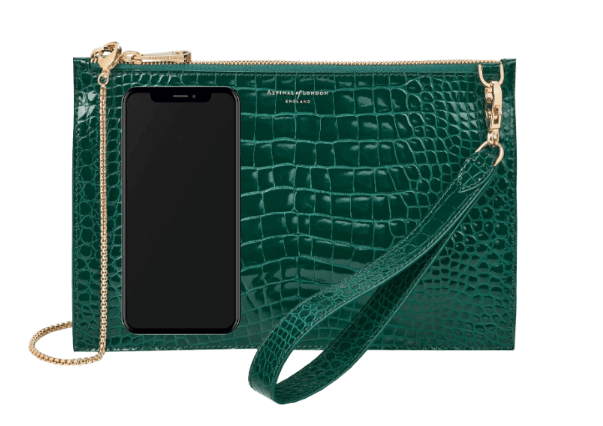
This online store goes one step further, and includes comparison with popular items such as an iPhone, a magazine, sunglasses, and a passport holder:
Product images should always sit above the fold, because they’re usually the thing that most customers want to see first in order to help make a buying decision. In fact, 93% of consumers consider images essential when making purchase decisions. Put them in pride of place on your product page!
(Wait up! What does above the fold actually mean? If something is “above the fold”, it means you don’t have to scroll down a web page at all to see it – instead, it’s instantly visible on the top part of the page. If something is “below the fold”, it means you have to scroll down to find it.)
For more tips on how to kickstart your product pages, check out our guide to How to Take Product Photos. And, to discover our top tips on How to Take Photos of Clothes to Sell for Your Online Store, our guide has everything you need.
Before moving on, make sure you have:
- Taken high quality photos of your products
- Shown your products from all angles
- Displayed product variants
- Taken close-up photos to show product details
- Thought about how to show context in your product photos
Show Clear Pricing
No matter how awesome your products are, people want to know the price before making a purchase. So it makes sense that you should display pricing as clearly as possible on your product page!
Even if your product is pretty expensive, you should still put the price in pride of place – near the product title or close to the “Add to cart” button is a smart design choice. This is because customers are usually automatically drawn to these areas, making the price easy to spot.
Other ways to help the price stand out include:
- Using a larger font size – your price should be one of the largest elements on the page
- Using a contrasting color to make the price “pop”
- Highlighting any discounts – show the original price next to the new, cheaper price, and be clear on savings
If your price isn’t instantly clear as soon as you land on the product page, you need to rethink your design – start off by applying the above tips, and then test it out on friends, family, or colleagues to see how quickly they can spot the price.
Pricing should always be displayed clearly above the fold – don’t make your customers go hunting to find how much your products cost!
Nobody is going to buy a product without first knowing how much it costs, so it’s a good idea to place it high up on the page. You should usually put it close to the product title or “add to basket” button.
Learn more pricing tips and tricks in our guide on How to Price a Product.
Before moving on, make sure you have:
- Placed your product price clearly on the page, above the fold
- Thought about ways to make it stand out, such as adjusting color and size
Create Persuasive Calls-to-Action
A call-to-action (or CTA) is usually a button or link that asks users to, well, take action! Examples include “Add to basket” buttons, “Sign up here” forms, and “Shop the collection” invitations.
Call-to-action buttons (or CTAs) are a critical part of the customer journey from browsing to buying. Getting shoppers to click on your CTA is the main goal of your product page, so it’s worth taking the time to get it right.
Without a CTA, shoppers can’t add the products they love to their basket, meaning you miss out on their purchases – which is less than ideal when you’re trying to make a profit!
This means it’s vital to have your CTA high up on the page – it should be easily visible, easy to click, and easy to understand. Here are our top tips for making the most of your call-to-action:
- Place it high up the page, above the fold – you usually see CTAs next to the product image, underneath the basic product information. You should be able to spot the CTA in under three seconds!
- Make it stand out by using a bright or contrasting color – this helps catch attention, and directs the customer’s gaze towards the button.
- Make the button large enough to click – whether that’s with a mouse on desktop, or a finger on mobile, the CTA button should be big and easy enough to click first time.
- Think about your language – most product page CTAs say “Add to Cart” or “Buy Now”, which are examples of direct, commanding language. Whatever wording you choose, make sure it clearly tells the customer what action they are taking by clicking on the button.
Your CTA should always sit above the fold, because it’s an essential part of getting conversions. If people love your product, but can’t find the button to actually buy it, guess what – you’ll lose out on sales!
Check out our How to Write a Call to Action guide to discover how to write more powerful and persuasive copy for your product page – and where to place it for maximum effect.
Before moving on, make sure you have:
- Decided where to place your CTA button on your product page
- Designed a big, bright, easy to spot button
- Thought about the wording you’ll have on your CTA to encourage customers to click
Write Informative Product Descriptions
Product descriptions are like the scaffolding built around your product images – they support the product photos, helping the customer to understand what the product is and why they should buy it.
In short, product descriptions are your chance to get persuasive and really sell the product, as though you were standing next to your customer in the store.
Most shoppers are looking for quick, easy, and scannable product pages, so you should write a short, snappy, and sweet description to sit above the fold next to the product images. Then, further down the page, you can have a slightly longer, more detailed description that gets into the ins and outs of the product.
- Focus on benefits, not features. For example, the fact that a storage container is made from high-density polyethylene won’t mean much to most shoppers – instead, simply focus on the fact that it’s dishwasher friendly!
- Avoid long sentences and complex language. People usually shop as a form of enjoyment or relaxation – they don’t want to be given a reading task, so keep it concise.
- Don’t use cliches, empty claims, or risk words. Avoid grand statements such as “these are the best socks ever”, and risk words that could put shoppers off such as “expensive” or “guilt” – and definitely stay away from cliches at all costs.
- Get persuasive. You’re doing the talking for your products, so try to use sensory words, power words, and storytelling to help excite your customers!
- Stick to your brand’s tone of voice. If your brand is playful, for example, have fun with your product descriptions and get creative with language.
Product descriptions give customers more information about the product than an image alone can provide. For that reason, it’s a good idea to have a short and sweet product description above the fold which is easy to scan quickly, and then a longer, more detailed version further down the page for customers who want more information.
For more tips on creating better product descriptions, check out our ultimate guide on How to Write Product Descriptions.
Before moving on, make sure you have:
- Looked at the best placement for your product descriptions
- Written a short, snappy description and a longer, more detailed version
- Followed our top tips for writing effective product descriptions
Leverage Social Proof
Did you know that 97% of consumers say that online reviews impact their purchasing decisions?
That’s why it’s vital to have some form of social proof above the fold, so that it’s instantly visible for online shoppers. The most popular way of presenting social proof is to show the product’s star rating near the product title.
Because this design layout is so common, your customers will be expecting to see a star rating straight away – so don’t make them go looking for it!
You should also include customer reviews further down the page, so that shoppers can easily see whether the product is popular, and why others enjoyed using it. This is vital because customers trust customer reviews 12 times more than product descriptions written by the seller!
You should always display the product’s star rating above the fold, because this is an important selling point that most shoppers want to see straight away. It’s then important to have full customer reviews lower down the page, in case shoppers want to browse through what other people have said about the product.
Other examples of social proof you can leverage on your product page include:
- Low stock alerts – this creates urgency and triggers a fear of missing out!
- A message telling the shopper how many other customers have viewed or purchased this product in the last hour – this acts as a virtual queue or crowd, and shows the shopper that other people are also interested in the product.
- “Customers also viewed/bought” product recommendations – this combines social proof with cross-selling, and is a great way of keeping your shopper in your store.
Before moving on, make sure you have:
- Factored star ratings and reviews into your product page design
- Thought about the other ways you can add social proof to your product pages
Provide Accurate Product Recommendations
So, your customer has added a product to their basket – hooray! But what now? They might simply check out, or click aimlessly around your other products for a bit. That’s okay, but what if there was a better way to keep customers shopping after viewing one product?
Say hello to product recommendations!
Think of these like those autoplay videos on YouTube, where you go to watch a single video and then find yourself three hours later watching cats knocking glasses off tables. Product recommendations suggest different products that the customer might like based on what they’re currently viewing.
If you can provide accurate and helpful product recommendations, it’s a great way of securing another purchase – and keeping a customer on-site even if they didn’t like the first product they viewed.
Amazon is the undisputed leader when it comes to product suggestions – have you ever been sucked in by its “Recommended for you” carousels? Alternatives include:
- “Customers also bought” lists
- “Similar items” suggestions
- “Top picks for you” recommendations
You can even encourage more people to create accounts for your store by promising better tailored recommendations – this creates a more personalized shopping experience, and can boost engagement too.
Product recommendations are a useful and effective way of keeping customers on your site, increasing the value of each transaction, and creating a more personalized shopping experience. However, product recommendations aren’t essential for getting customers to convert, and can even distract them from the product they’re currently viewing.
That’s why product recommendations are best placed below the fold.
Another way of suggesting products is to feature other products for sale within product photos. For example, a model might be wearing boots and a skirt as well as a jumper, and customers can “shop the look” or “complete the set” – and fill up their basket along the way!
Before moving on, make sure you have:
- Set up product recommendations
- Looked at different ways to promote related products
- Decided whether you want to code recommendations yourself, use an app, or start with an ecommerce builder
Find out more
- Looking for a theme that includes a product recommendation feature for you? We shortlisted the 14 Best BigCommerce Themes for you to browse!
Stay Consistent!
Okay, this isn’t an actual design feature that you have to include on your product pages, but it is an important design rule…
Whether you choose to implement all of these features on your product page (which we highly recommend), add extras, or just pick out key elements, your product pages should always be consistent.
Whatever you do, don’t chop and change your design choices, because it will confuse customers and distract from your products!
Amongst other things, this applies to:
- Colors
- Fonts
- Image sizes
- Page structure (i.e. how everything is laid out)
- Tone of voice (in product descriptions etc.)
Now that we’ve walked you through the most important important elements to have on your product page, you might be wondering exactly how you’re supposed to fit them all together. Well, as it happens, that’s exactly what we’re going to show you next!
Find Out More
Now you know exactly what to feature on individual product pages. But what about product category pages? We have a whole separate guide for that. Discover How To Create Category Pages for your store next!
How to Lay Out Your Product Page
So, you’ve got all the essential elements down – product photos, pricing, descriptions, social proof, and more, all ready to go. But putting them all together onto a single page can seem a little overwhelming – you want to avoid clutter, while still letting all the important stuff shine.
Luckily, we’ve got some industry secrets to share with you that’ll make putting your product page together much easier. We’re going to share the top three product page templates with you, and help you decide which is best for you!
Template 1: The Universal Product Page
Best for new sellers, suitable for any type of product
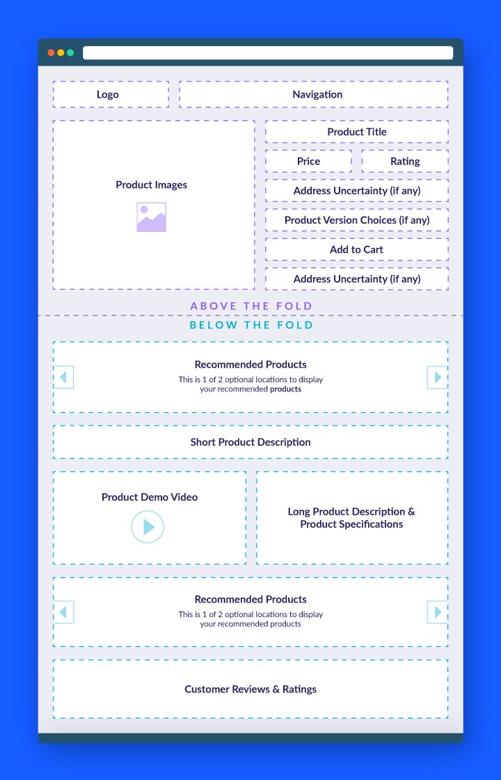
This product page design is the most common, so you’ll probably recognize it!
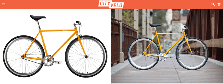
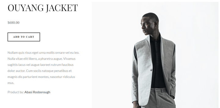
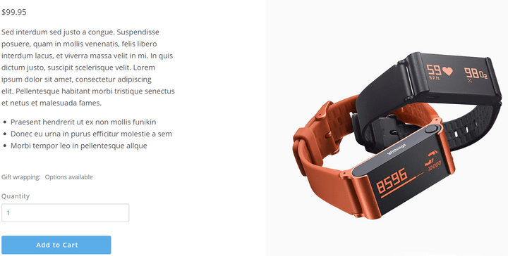
Why does it work so well? Because people read from left to right, they see the product image first – if they like what they see, then they’ll stick around on the page to learn more about the product and see if they want to buy it.
You’ll notice that the product title, price, star rating, and “add to cart” CTA all come high up on the page, above the fold.
Template 2: The Image-Focused Product Page
Best for creative or visually appealing products such as jewelry, art, or furniture
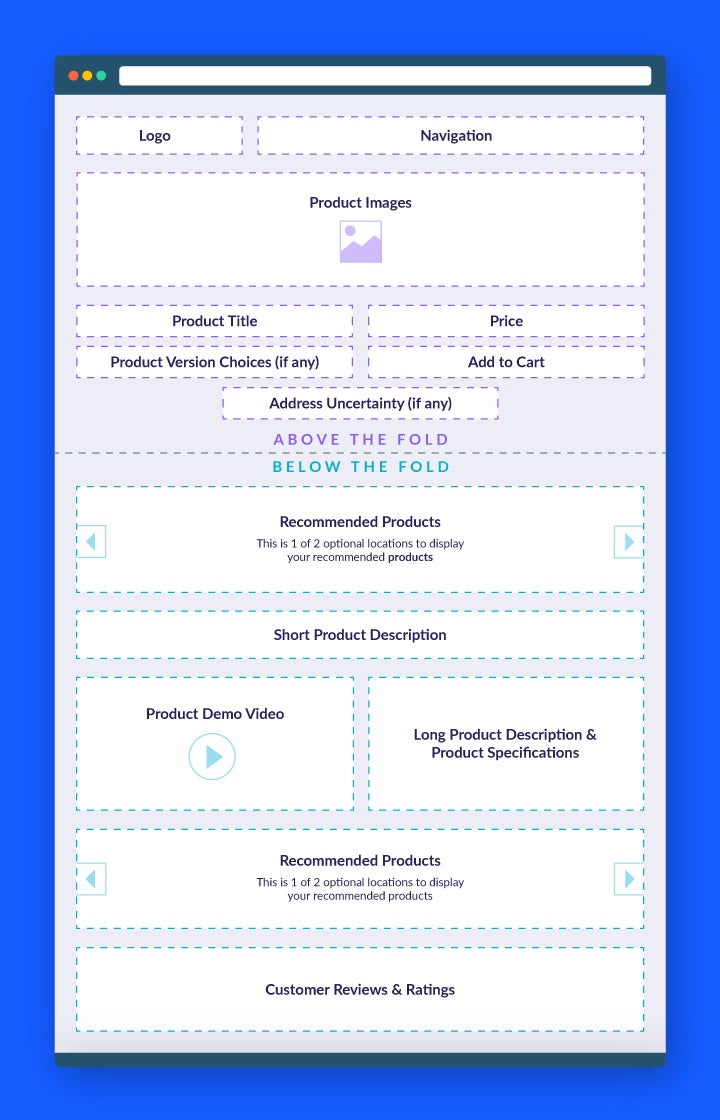
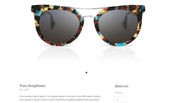
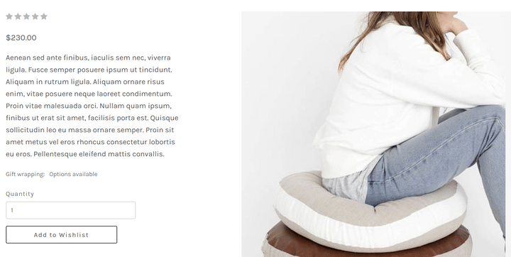
This template is perfect if you want to show off your products, because the photos are the main focus of the product page. If you choose this design, you need to ensure that your photos are of the highest quality!
This is a really eye-catching template design that puts your products at the forefront of the page – customers can then continue down the page to find out more information. Still, all the important stuff is above the fold, making life easy for more casual browsers.
Don’t choose this template if you’re selling products that aren’t sold by their looks – for that, check out the third template instead!
Template 3: The Feature-Focused Product Page
Best for functional products that rely more on features than looks, such as tech and DIY tools
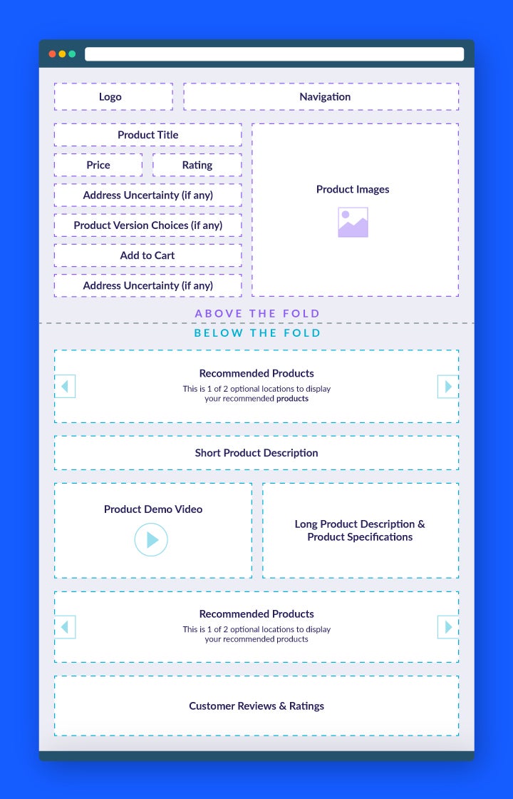
This product page template is perfect if your products’ features are the selling point, rather than their visual aesthetic. Examples include tech, digital appliances, and mechanical tools – anything where its function is the main reason for purchase.
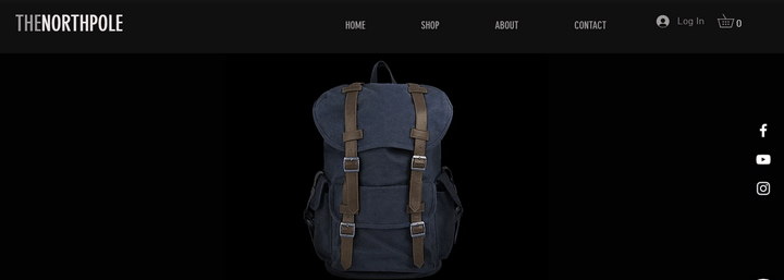
This template focuses on the product description and specification, drawing attention to the features first. The product images serve to back up the written information, rather than the traditional tactic of having the product photos take center stage.
If you choose this template, you’ll need to put extra thought into your written content – you’re not using images to entice your customers, but rather your product descriptions. Make sure you’re informative, descriptive, and address any questions or concerns the customer may have straight away.
Summary
We’ve looked at the top 15 product pages from across the internet, covered the most important and essential features to include on your product page, and walked you through the best ways to lay out your product page design.
Our final advice? That creating an effective product page isn’t something that you’re likely to get done in one sitting. So, here’s a recap of the key things to remember when designing your product page:
How to Design a Product Page: 7-Step Recap
- Use high quality product images
- Show clear pricing
- Create persuasive calls-to-action
- Write informative product descriptions
- Leverage social proof
- Provide accurate product recommendations
- Stay consistent!
Other important features include customization options, shipping and returns information, and an FAQs section. There are three main templates you can follow depending on what type of products you sell, and plenty of free ecommerce templates to help you get started with your designs.
Remember that the main purpose of any product page is to persuade customers to add the product to their basket, and then complete the purchase – so always put the customer at the forefront of your design decisions.
Happy designing and selling – and feel free to come back and let us know how you get on!
More information
- Want more content insights? Find out what dynamic content is – and how to use it to turbocharge your website
FAQs
To learn more about the power of social proof, and how it can improve your marketing endeavors, check out our infographic exploring How to Use Online Reviews to Market to Different Generations for some surprising facts!
22 comments