13 Best Contact Us Page Examples to Inspire You
Our independent research projects and impartial reviews are funded in part by affiliate commissions, at no extra cost to our readers. Learn more
If your website’s like a house, your Contact Us page is like the letterbox – or the doorbell. It’s how people will reach and interact with your business (which, thanks to one of the best website builders, you’ve already created a stunning online presence for) – whether that’s to learn more about your brand, or to enquire further about engaging it.
It goes without saying, then, that your business doesn’t just need a Contact Us page. It needs a good one.
To that end, we’ve pulled together the 13 best Contact Us page examples from across the internet.
These Contact Us pages look good, read well, and make a compelling case for their users to get in touch. So read on, and explore them all below!
What Is a Contact Us Page?
A Contact Us page is a section on a website dedicated to allowing that site’s audience – be they existing clients, potential customers, or simply interested parties – to contact the business. A Contact Us page typically includes the business’:
- Email address
- Phone number
- Physical address(es), with an accompanying map
- A contact form for enquiries
- Links to social media and help and support resources
Basically, a Contact Us page serves as a bridge between your brand and the people engaging with your website (so, potential customers!). A well-designed Contact Us page enhances your website’s user experience and builds trust. Meaning it should also be:
Easy to Find
- The link to your Contact Us page should be prominently displayed in the main navigation menu or footer of the website. Users need to be able to locate it easily without having to search extensively.
Easy to Use
- Your Contact Us page layout should be clean and uncluttered. Avoid overwhelming visitors with too much information or too many form fields
- Use a simple and intuitive contact form that asks for essential information – such as name, email, and message – and avoid asking for excessive details that may deter users from filling out the form.
- Provide clear instructions on how to get in touch, whether it’s through a contact form, email, phone, or social media channels.
Informative
- Include multiple contact options such as an email address, phone number, and physical address (if applicable). Some users prefer different methods of communication, so offering various options caters to a wider audience.
- If your business has multiple locations or departments, provide specific contact details for each, making it easier for visitors to reach the right person.
- Mention the business hours to set realistic expectations about when users can expect a response.
Reassuring
- Use a friendly and approachable tone in your messaging to make visitors feel welcome and appreciated.
- Assure users about their privacy and how their contact information will be used. A brief privacy statement can go a long way in building trust!
- If possible, include a photo or brief bio of the key people they might be in touch with. This adds a personal touch and humanizes the interaction.
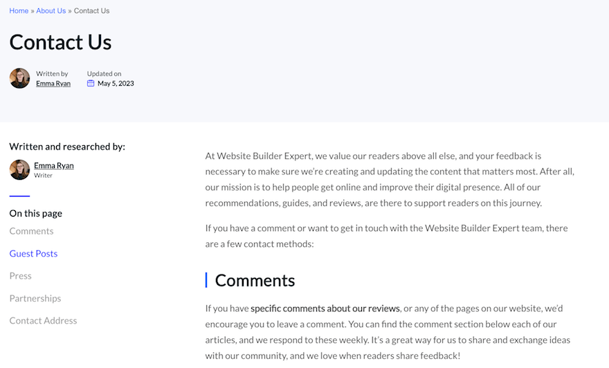
Why Does Your Contact Us Page Matter?
Contact Us pages are rarely the belle of the ball. Typically, they’re not the first place a customer will land on your website (the homepage) or their top destination for learning about your business (the About Us page).
But what it lacks in profile, a Contact Us page makes up for in usefulness. Here’s how:
- It generates leads for your company: With an embedded contact form for people looking to make enquiries, a Contact Us page can be a vital source of warm leads – ready to deliver straight into the lap of your sales team.
- It builds authority and website credibility: It’s a subtle psychological phenomenon, but your Contact Us page goes a long way to convincing your potential customers that your business is a trustworthy, credible place to shop.
- It boosts customer loyalty: Contact Us pages aren’t just for attracting new customers. They’re the first place existing customers looking for assistance will go. With a good Contact Us page, they’ll feel more satisfied and supported – leading them to feel more loyal to, and more engaged with – your business.
13 Inspiring Examples of Contact Us Pages
Ready to dive into our 13 favorite Contact Us page examples on the internet?
Same here!
1. Yeti
Yeti sells ultra-durable water bags, bottles, and apparel for lovers of the great outdoors – and its Contact Us page reflects that to a tee. Set against a backdrop of a relevant, aspirational image – a hiker surveying an expansive mountain landscape – Yeti’s Contact Us page is both inspirational and on-brand.
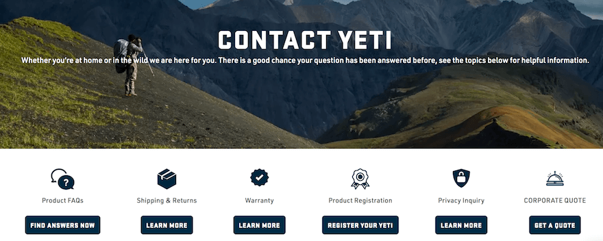
We also love how easy Yeti’s Contact Us page’s UX (user experience) is. Icons, clear call to action (CTA) buttons and plenty of white space combine to make the page simple to explore at a glance, and even simpler to navigate. You can view FAQs, information about warranty, shipping, returns, and registration – and even request a bespoke quote.
2. Red Bull
Despite having made it onto this list, Red Bull – purveyors of the popular energy drink that, if its marketing spiel is to be believed, “gives you wings”, doesn’t have a Contact Us page, per se. What it does have, though? A contact assistant.
The Red Bull Assistant is an automated chatbot, which utilizes advanced algorithms to answer your question. It filters through your enquiry to funnel you to the right part of the website, and – if it can’t answer your question – will connect you to a member of Red Bull’s customer support team.
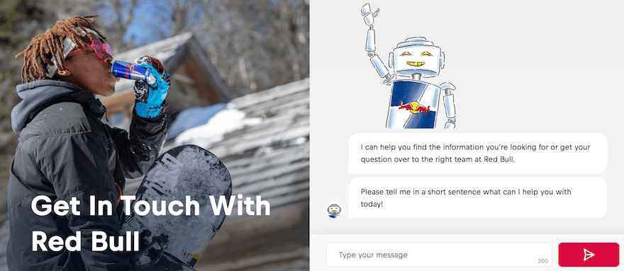
Aside from this nifty feature, Red Bull’s Contact Us page is packed with content. It contains a carousel with links to Red Bull’s athletes, events, merchandise and more, plus information about the company.
Refreshingly, Red Bull’s Contact Us page is also image-centric, leading with a large, full-length image of a surfer emerging from the water. It’ll appeal to active, sport-addicted people – Red Bull’s exact target demographic!
3. HubSpot
Popular CRM (Customer Relationship Management) provider HubSpot has offices all over the world – and the company ensures, through its Contact Us page, that each one is contactable.
From Berlin to Bogota, HubSpot’s Contact Us page features a phone number and physical address for each of its 12 offices around the globe. As well as each individual number, broken down by country, of its American, European, and Asia-Pacific located presences. Basically, it doesn’t skimp on the details!
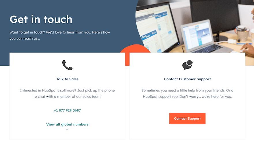
Inspirational in its comprehensiveness and clarity – the page is neatly laid out and simple to navigate and engage with – HubSpot offers a shining example of what an excellent Contact Us page can look like.
4. Chipotle
Chipotle’s Contact Us page differs from the norm – particularly among fellow fast food franchises – in that it’s basically an extended list of FAQs. From queries around getting food delivered to questions about the menu, loyalty program, or becoming a franchisee, Chipotle’s customers will find everything they need in front of them. And if they don’t, “Pepper” – Chipotle’s chatbot – should be able to assist.
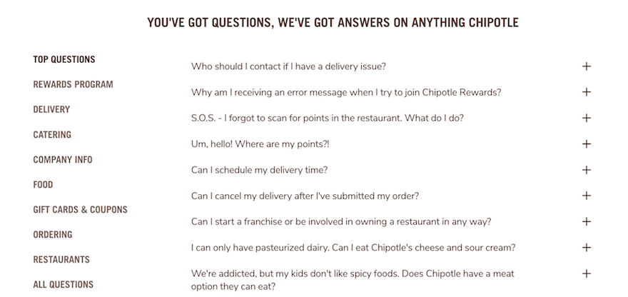
Better still, the FAQs are written in the fun, conversational style so integral to – and recognizable as – the Chipotle brand. Reassuring the customer with answers to their questions, all while putting a smile on their face.
Find Out More
Do you like what Chipotle does with its FAQs? Check out our full list of FAQ Page Examples for more inspiration from across the web!
5. Sleeknote
Danish-based website pop-up builder Sleeknote channels its Scandinavian roots to deliver a Contact Us page that’s slick, sleek, and seamless as its name.
Kitted out with clean lines, crisp copywriting, and splashes of classy purple font, Sleeknote’s Contact Us page has a breezy UX. But Sleeknote never sacrifices substance for style. It’s a treasure trove of information – with links to product demos, webinars, guides, success stories, a blog, and an extremely comprehensive help center.

6. Zendesk
Prominent CRM and help-desk software provider Zendesk offers up a Contact Us page that keeps things simple.
Set against a colorful backdrop, two large white blogs let Zendesk’s customers contact the sales team, or access product and account support. Clearly laid out this way, Zendesk cleverly funnels customers to the part of the website they need to be in.
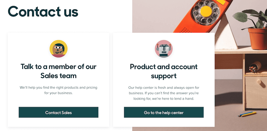
Like HubSpot, Zendesk’s Contact Us page also provides links to every one of its offices around the world – again making sure that customers are in the right place, before they get through to a support agent.
7. Glossier
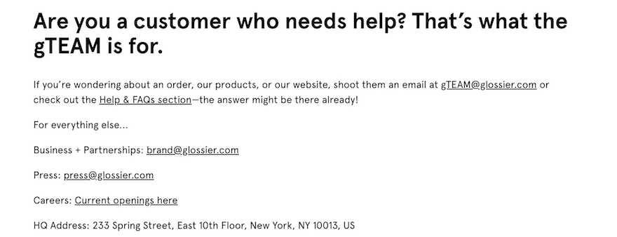
Boutique makeup brand Glossier’s Contact Us page isn’t one for wasting words, either. A visually striking – yet deceptively simple – page is light on copy, but big on information. We love it because of how easy Glossier makes it for its customers to access the right department.
Glossier’s Contact Us page signposts clear links to its Business + Partnerships, Press, and Careers sections, respectively – as well as the address of its New York-based headquarters.
But despite the amount of information here, the page’s conversational tone – largely down to the warm, friendly nature of the copywriting – ensures it never loses its down-to-earth, human feel.
8. Moz
Moz’s Contact Us page fuses conversational copywriting, easy-on-the-eye design, and a social conscience to create a bright, positive – and effective – Contact Us page. As it should do – Moz is, after all, a prominent SEO tool, so its website and branding needs to set a strong example!
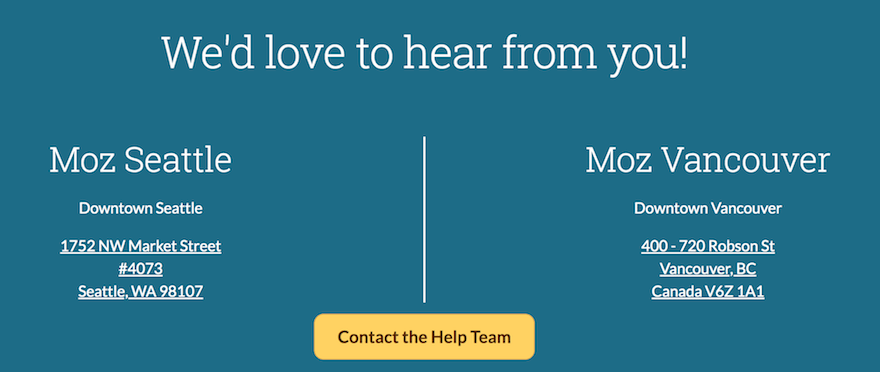
A large yellow CTA button makes it easy to get straight through to Moz’s support team, while physical addresses, and maps, of its Vancouver- and Seattle-based locations allow Moz’s customers to contextualize it in the world. Further down the page, a statement of land acknowledgment demonstrates Moz’s social and community credentials.
9. Notion
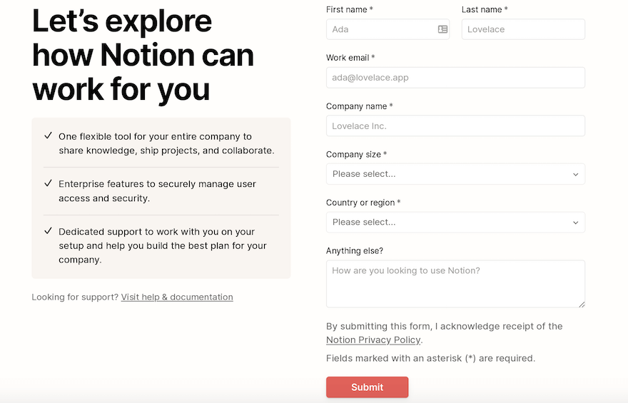
Creativity and productivity tool Notion’s Contact Us page doesn’t get bogged down over-explaining its services. Instead, it keeps the focus purely on the customer – and how Notion can work for them. The page clearly, succinctly explains its core benefits, while an extensive contact form asks “how are you looking to use Notion?”
For customers looking for support, rather than to contact the company directly, the page offers a link to the help and documentation section of its website, allowing people to self-serve.
10. Accenture
Accenture, an IT and consulting company, maintains the professional tone it cultivates across the rest of its website with a crisp, clean Contact Us page. Domestic and international phone numbers are displayed in large, bold font on Accenture’s Contact Us page, while a location-finder enables Accenture’s audience to track down its offices across the world.
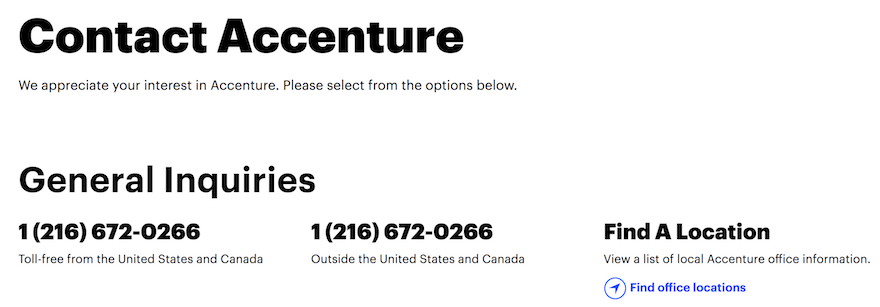
Also on the page is a collapsible list of resources aimed at specific subsections of Accenture’s audience: including job seekers, media and industry analysts, investors, suppliers, and existing employees. Meaning that, whoever’s contacting Accenture – and for whatever reason – they can get straight through to the support they’re requesting.
11. Burnt Butter
Burnt Butter is a cake shop based in Melbourne, Australia. Its whole website channels an inviting, inclusive feel, elicited through clean design and a simple, vibrant user experience (UX). Its Contact Us page is no different.
Harnessing white space and a stripped-back, uncluttered design, Burnt Butter’s Contact Us page never sacrifices substance for style. It contains a staggering amount of information – including Burnt Butter’s physical address, phone number, and its kitchen availability. Users can click straight from the page to Burnt Butter’s dedicated FAQ section and explore its opening and holiday hours, too – plus browse all the information they need about custom orders and wait times.
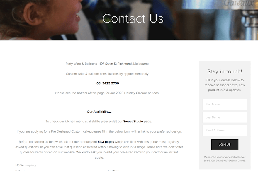
What’s more, Burnt Butter’s Contact Us page provides an email signup widget where users can get onto the cake purveyor’s mailing list. Just below, there’s a comprehensive contact form, which collects not only the basic details about the enquiry, but asks about their approximate budget, number of guests, and some info about how they found Burnt Butter in the first place.
A piece of cake, really!
12. Udderlicious Ice Cream
While Udderlicious Ice Cream’s Contact Us page‘s boxy, back-to-basics design may not suit those with more refined aesthetic tastes, it certainly gets the job done from a functionality perspective. And demonstrates that often, it’s not how a Contact Us page looks that’s important – but how easy it makes it for the user to read and digest the page’s most vital messaging.
The London, England-based ice cream provider showcases the physical address and contact numbers of its three locations in the city, as well as opening hours and a phone number for each. On top of this, there’s a clearly signposted email address where ice cream enthusiasts can get in touch, plus an embedded map widget enabling to pinpoint each store’s exact location.
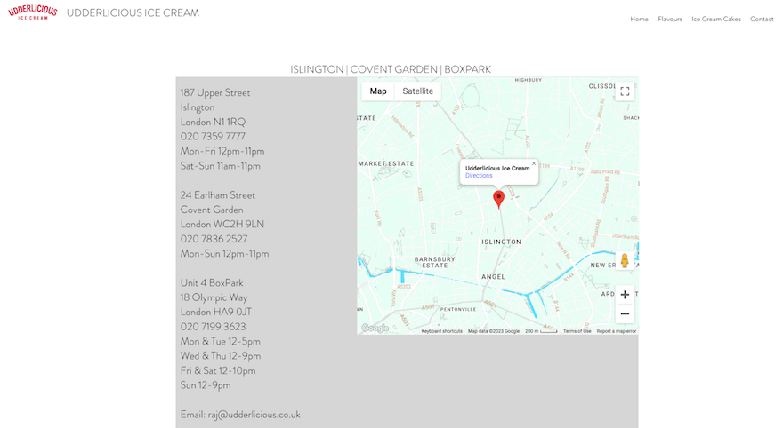
Social links down at the bottom of the page facilitate a smooth transition to Udderlicious Ice Cream’s Facebook and LinkedIn presences, and… that’s pretty much it! This information is all packed into a square at the centre of the screen, and flanked on all sides by a border of clean, attractive white space.
Drawing our, and Udderlicious’s audience, to the main event, and their main purpose – getting their hands on some delicious dessert!
13. Old Red Cow
Old Red Cow is a pub located near central London (not too far from Udderlicious Ice Cream, in fact), and is the perfect place to stop for a cold drink – before your cold sweet treat! But of course, London is full of pubs, and they – and their websites – need to stand out to get people through their doors.
Built with Squarespace – a website builder popular for its gorgeous design templates and ease of use – Old Red Cow’s Contact Us page (and its online presence at large) is attractive and unique. But why?
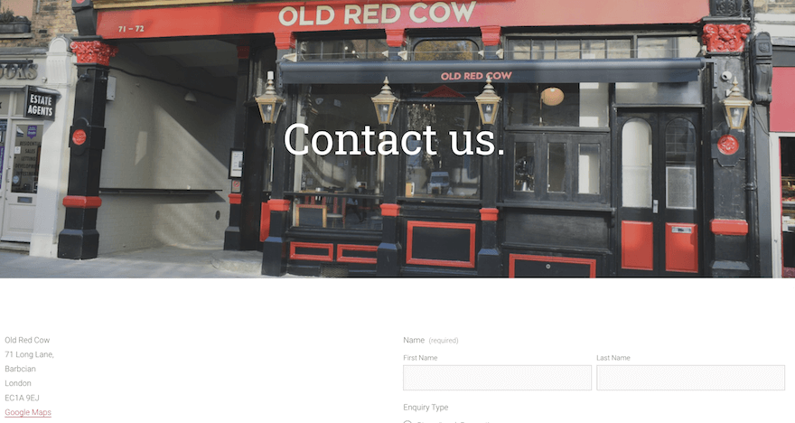
Well for starters, it contains a full-width image of the pub itself. (An excellent use of imagery that all too few Contact Us pages remember to emulate.) Below this, Old Red Cow notes its physical address – an inclusion that’s particularly important for a business that relies on bricks-and-mortar trade alone, rather than online sales – as well as its phone number and email address.
Next to this, the pub includes a simple contact form, where enquirers can add their name, contact details, and the type of enquiry – be it for a dinner reservation, a lunch booking, a party, or a Christmas function – plus a short personalized message. All in all, Old Red Cow’s Contact Us page does everything a good Contact Page should – without any unnecessary frills or fanfare.
And there’s a lot to learn from that!
Summary
To say a Contact Us page is important is, quite frankly, an understatement. It’s how your potential customers will get in touch to learn more about your business and purchase your products and services. And how your existing customers will contact you to seek help and support.
Above, we’ve presented our top 13 favorites from across the web. With friendly, conversational tones, clear links to physical offices and contact numbers, and aesthetically simple, pleasant designs, these Contact Us page examples are the best.
So get inspired!
FAQs
If you don’t have a lot of experience – or confidence – in creating this kind of Contact Us page, explore our web design best practices for our top tips and inspo. Or, take a more hands-off route – and hire a web designer to do it for you!
Leave a comment